

I honestly can’t remember the last time I paid for something with physical cash, let alone a coin.
Actually, I take that back. I have a single quarter in my car’s cup holder, deemed my “Aldi Quarter.” If it ever goes missing, I freak out that I’ll be in desperate need of a quarter in the Aldi parking lot, juggling a case of water and a carton of eggs, staring at a perfectly good row of chained-up carts I can’t use, right when I need one most. The only pennies I’ve seen in months live deep in the crevasses of my purse.
Interestingly, this past Thursday, November 12, marks exactly one year since the U.S. Mint struck its final one-cent coin at its Philadelphia facility, ending the run of America’s longest-running coin.
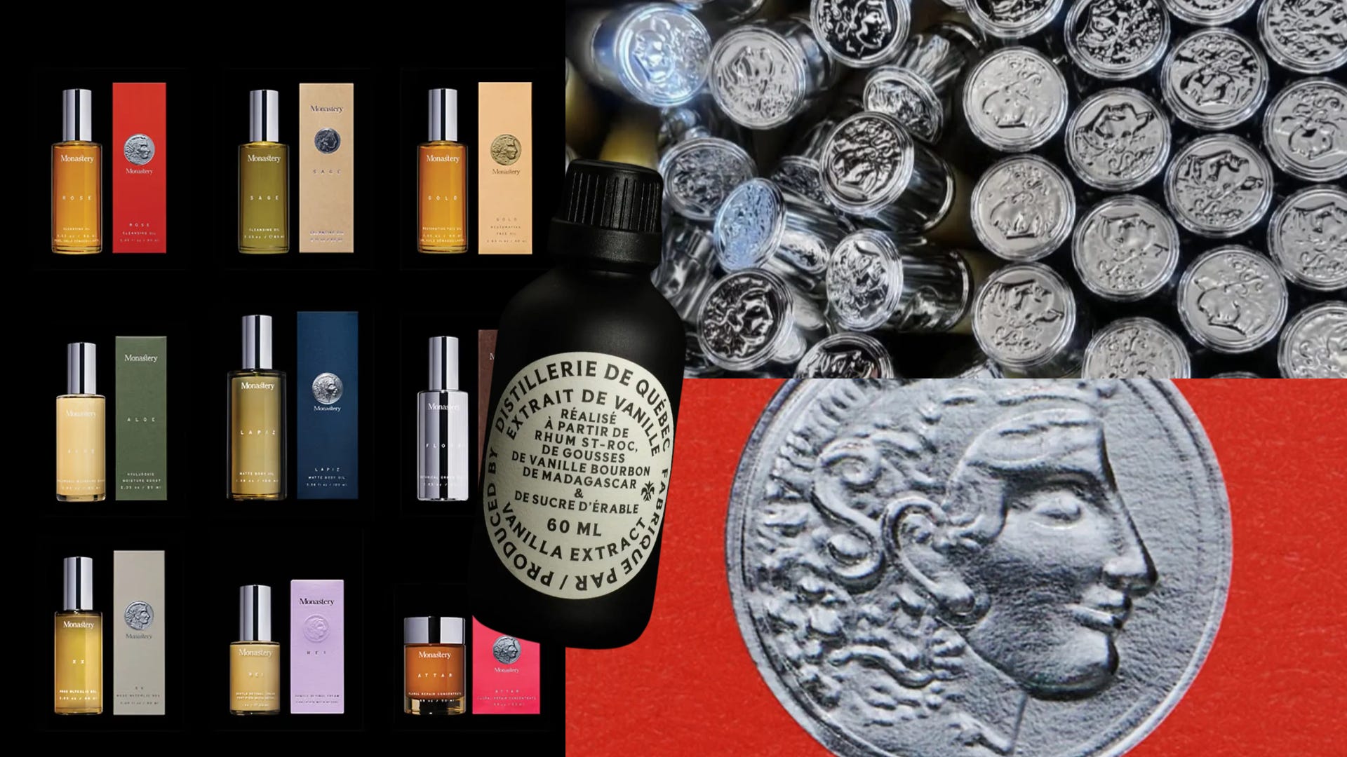
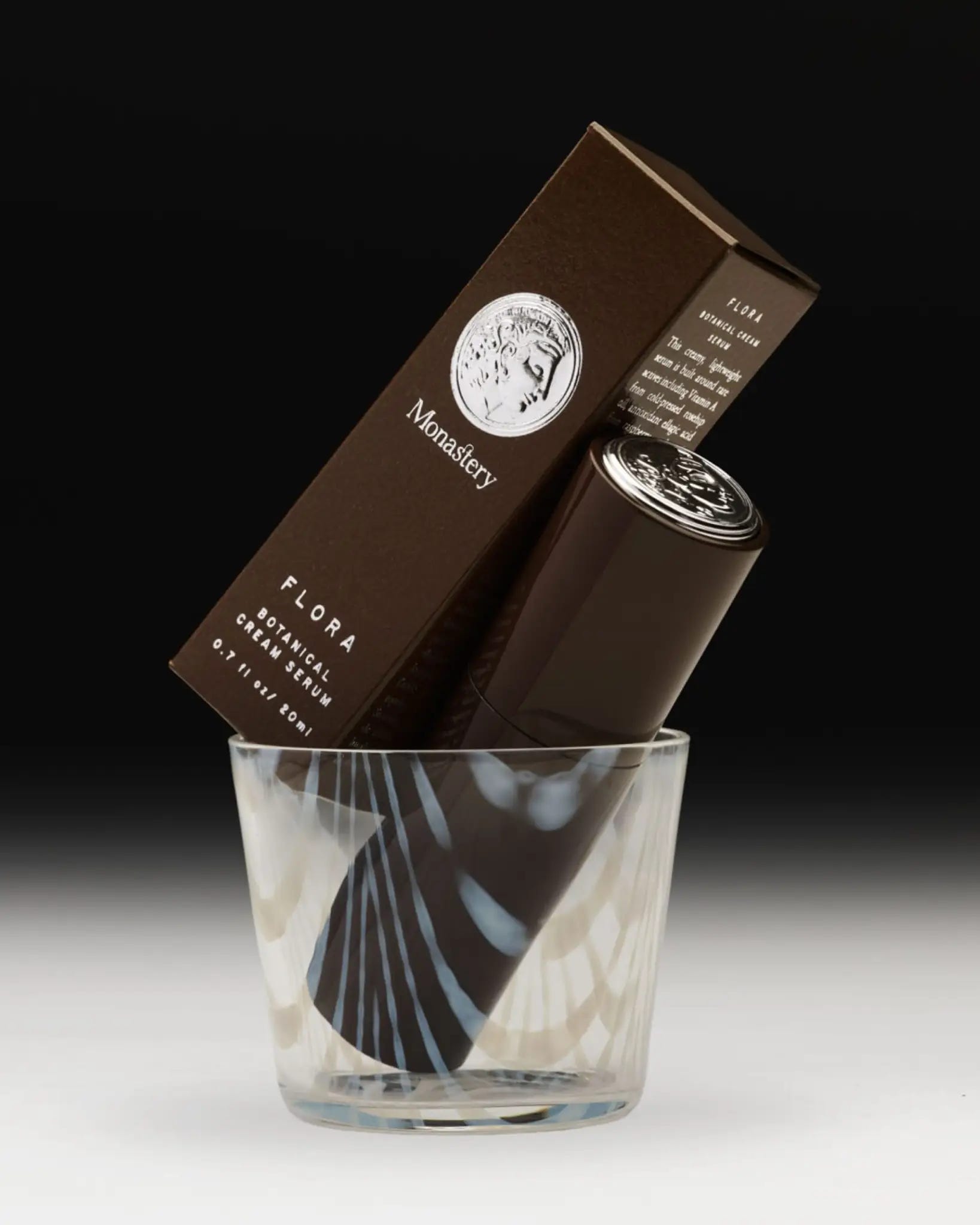
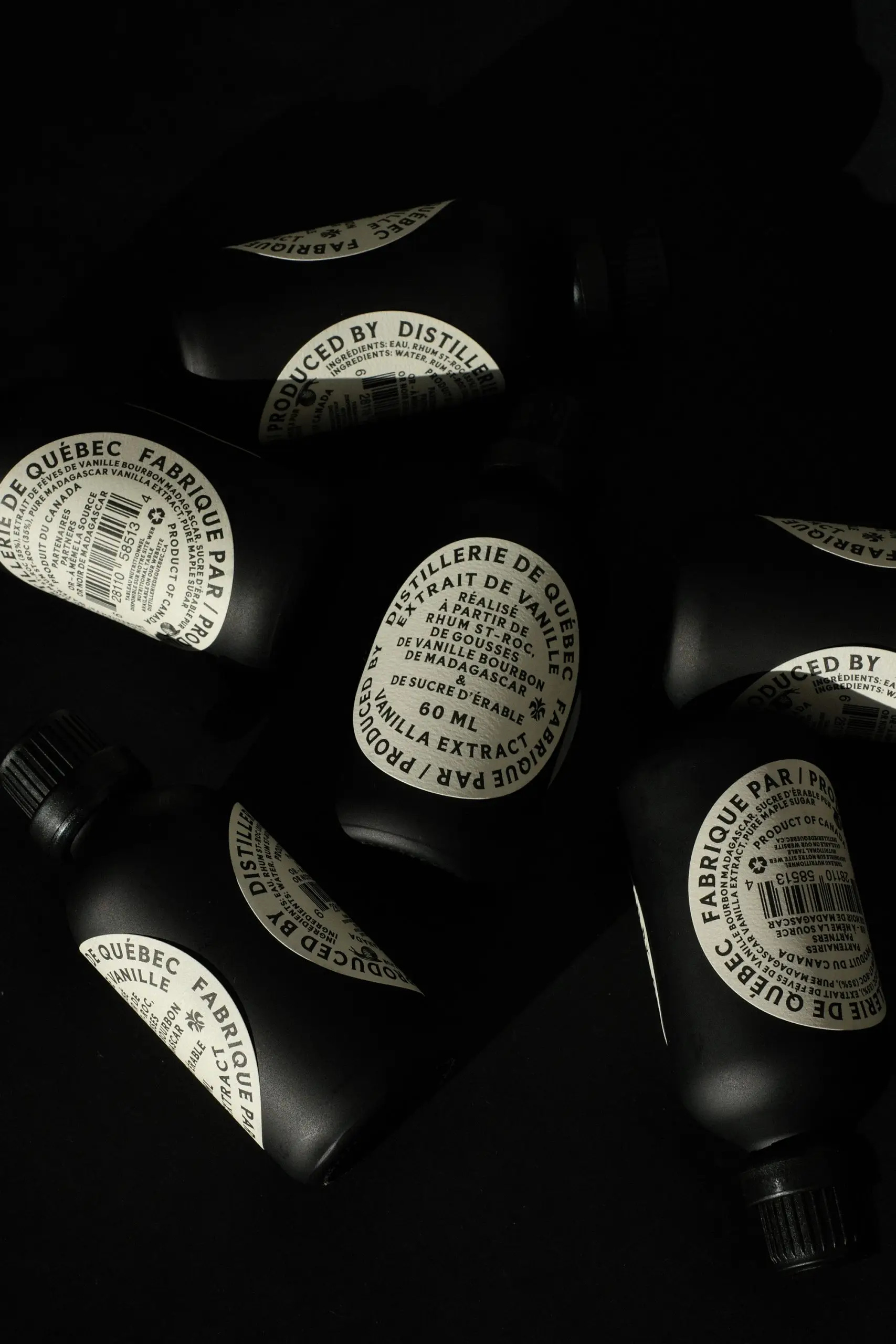
So it’s a little funny that as money quite literally disappears from our pockets, I’ve been finding coins showing up on packaging more and more. We’ve seen it with Creech Studio’s Monastery, which presses a silver coin with a classical profile, like ancient Greek currency, into every box and repeats it on the cap, but also with Criterium Design’s vanilla extract, a round label drawn from old Quebec signage and coin engravings.
We’re living in a cashless world that’s obsessed with analog, and nothing is further from a tap-to-pay screen than a little disk of stamped metal. “We don’t think it’s a coincidence that it’s happening as money disappears,” says Shy Trutwein, director of After Hours Studio. “We’re in a moment where the idea of value itself is being questioned. What are physical things worth? What is labor worth? What skills are worth when AI can do them in seconds?”
Trutwein sees the shift from coins to screens as driving this movement. “In addition, we went from trading goods, to trading coins, to paying with a number that is now on a screen. So when money stops being something you can hold, brands reach for the last physical shorthand for worth that everyone still recognizes. A coin can say ‘this is valuable’ before you’ve read a single word.”
That ability to communicate before a single word is what coins were actually designed for. “Coins were the world’s first means of mass communication, each deliberately designed to carry as much useful information as possible,” says Dr. Frank L. Holt, Emeritus Professor of Ancient History and author of When Money Talks: A History of Coins and Numismatics. Ancient Rhodes put a blooming rose on its coins because rhodon is Greek for the flower. It’s the same reason Georgia’s state quarter has a peach. “Even for the illiterate, an image could announce the city’s name,” Holt says. “I call coins history and culture on the outside, money in the middle.”

Dr. Holt continues, “Coins are the original brand system: a tiny, mass-produced object that carries a symbol, a portrait, a motto and a promise of value, and gets passed through millions of hands. Designers can’t help but respect that.”
Mitch Wiesen, the Philadelphia-based designer, illustrator, and typographer behind the design archive Tack-Tile, agrees. “Coins are the original ‘badge.’ Central images, type set in a circle, retaining legibility and clarity at small sizes without sacrificing elegance, strength, or timelessness.
Wiesen also draws a line I hadn’t considered, between worn coins and the wave of soft, melty typography we’re seeing everywhere right now. “I think there’s also something really appealing about the way time slowly erodes coins, especially their lettering,” they say. The crisp serifs struck into metal don’t stay crisp. “Time softens all things, and I think as designers we’re really drawn to the way things age and change.”
Coins tap into something bigger than this overly done sense of “nostalgia” that everyone is seemingly addicted to right now. “There’s also a craving for proof of a human hand. As AI makes everything infinitely reproducible, we’re clinging to things that feel struck, stamped and made, with real history and storytelling behind them,” Trutwein says. That’s why the motif lands so well as embossing, debossing, foil, and actual metal. Packaging that feels pressed into existence reads as made by someone.
Wiesen puts it even more plainly, “Coins hold weight, literally and metaphorically. They have heft in your hand, and they have permanence. They feel like something an archaeologist could dig up one day, unlike everything that’s stored ‘in the cloud.’”
“I think all people, not just designers, are dying for things that feel real; that you can hold in your hand; that will stand the test of time,” Wiesen adds.
Holt sees that permanence as the point. “Our coins literally have an official stamp of authority, trust, and value on them. Money, as I explain in my book, only works because we trust that stamp and we recognize that imagery. That connection never goes away. To find that sort of connection is, excuse the pun, money to advertisers.”
There’s kind of a more innocent, sweeter side to it too. “Coins have almost become vintage,” says Jasmine Gallagher, Director of After Hours Studio. Pennies and dimes are all over our songs and sayings, she notes. “We’re not hearing songs about tap-to-pay and crypto (yet).”
Of course, slapping a coin on a box doesn’t automatically make the design better, and this idea of putting a coin on a container doesn’t sit right as being labeled a trend.
“There’s a difference between a design trend and a historical reference finding renewed relevance,” Gallagher remarks. “Something like glassmorphism belongs to a particular moment in digital design. Coins weren’t created as an aesthetic; they were functional objects that became expressions of culture and craft. Analog and archival references have always been a counterpoint to technological change, and this is just the latest round.”
Monastery is the perfect example of coins being used thoughtfully. “The founder’s Greek heritage runs through the whole brand, so a coin that looks lifted from ancient Greek currency feels like an heirloom, not a prop,” Trutwein says.
Holt also has a favorite brand example, “I have always admired the flying Pegasus used by Mobil, not least because it evokes the beautiful design on ancient Corinthian coins.”
For designers who want to get it right, everyone I spoke to said the same thing: do your homework. “I would encourage designers to study numismatics. After all, a coin designed 25 centuries ago is still highly communicative today,” Holt says. Wiesen says designers should be “studying all the design work that has come before them, because you can’t make something new if you don’t know what’s already been done.” Wiesens’ Tack-Tile archive’s “circle” tag is a great place to start, full of 1940s milk caps, 1920s citrus crate labels, and 1950s beer coasters.
But I also appreciated Gallagher’s gut check on the whole trend of it all. “We’re also curious if we’re looking at this through a very Western lens. Cash is still a big part of everyday life in a lot of the world, so the idea that coins are disappearing or becoming nostalgic might not be a universal experience.”
But Gallagher also doesn’t see this as a passing moment, and neither do I. Coins are functional objects that became a massive part of culture, so they’ll keep coming back whenever technology moves faster than we’d like. “As for what’s next, we think the coin is just the gateway. Expect the same pull toward other objects the digital world is making obsolete: tickets, keys, receipts.”
Stay Fresh,