


There’s no shortage of sayings about how what we wear shapes how we think. But can it shape what we design, too?
I’ve long been intrigued by how packaging trends occasionally mirror fashion, and as gorpcore’s technical details and utilitarian aesthetic have begun appearing in packaging design, I’ve started wondering whether the clothes designers wear to the studio might be seeping into their work.
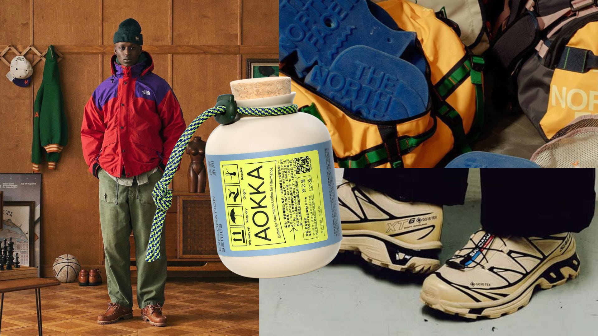
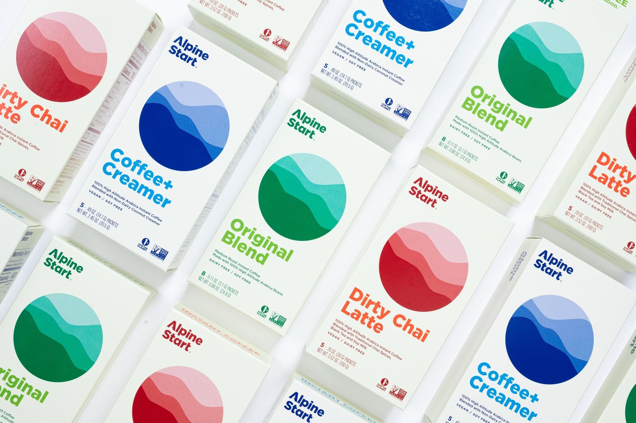
At its root, gorpcore brings the practical look of outdoor gear into everyday style. Brands like AlpineStart and Fungo Design’s Harvestime illustrate this. Alpine Start’s compact, single-serve coffee sachets bring the pack-light practicality of outdoor gear to an everyday ritual, while Harvestime creates a stronger visual connection, inspired by soil and regional landscapes, with a palette and organic patterning that echo gorpcore’s outdoorsy aesthetic.
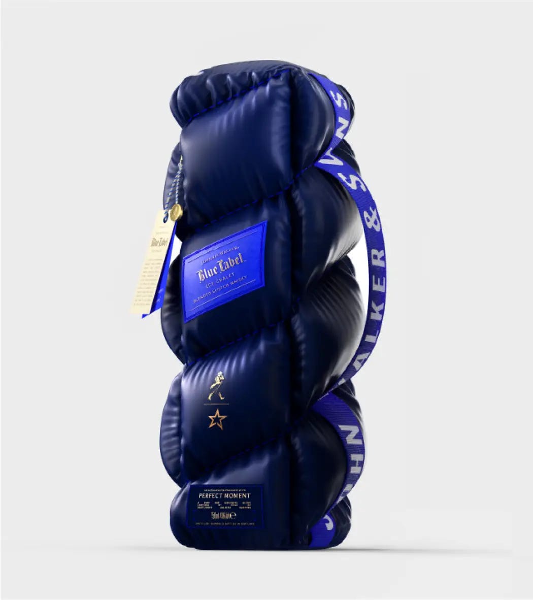
But even brands as big as Johnnie Walker have wrapped a bottle in puffer-coat material, partnering with the ski brand Perfect Moment to appeal to a new wave of luxury drinkers.
It’s easy to imagine a designer’s favorite hiking jacket inspiring their next packaging project, but I think the connection is less literal than that, even with the Johnnie Walker example. At their core, outdoor clothing and packaging both need to tell consumers what they can do. The real question, though, is whether designers are borrowing the look of high-performance gear or taking inspiration from how it makes practical details feel appealing.
The brands behind this world of gorpcore are certainly doing well. In August, Amer Sports reported that its Outdoor Performance business, which includes Salomon, grew 37% year on year in the second quarter of 2026. Its Technical Apparel business, led by Arc’teryx, grew 32%. By no means are designers the only ones wearing these brands, but it shows momentum behind these outdoor names among the general population.
For Elizabeth Goodspeed, an independent designer, art director, and writer, understanding the appeal starts with remembering why outdoor gear looks the way it does. It’s all about intention and purpose. Reflective materials help people stay visible. Bright colors make details easier to spot. Looking good is certainly a welcome bonus. And packaging has its own practical demands, from ingredient lists to nutrition panels. Rather than treating these as awkward extras, designers can make them part of the look.
“For food and sunscreen, you are required to put the nutrition label or ingredients panel. As a designer, you can either design the whole pack so it’s stunningly beautiful, and then just deal with there being an ‘ugly zone,’ or you can lean into the aesthetic of those requirements and make them feel more like part of the packaging.”
Love and Money’s packaging for Omega Yeast shows how this can play out in design. Brewers choosing between yeast strains need to understand what each one offers, so the packaging needs to communicate plenty of useful information. “We wanted the packaging to feel as considered and high-performing as the product itself,” says Love and Money creative director Elizaveta Pogozzov.
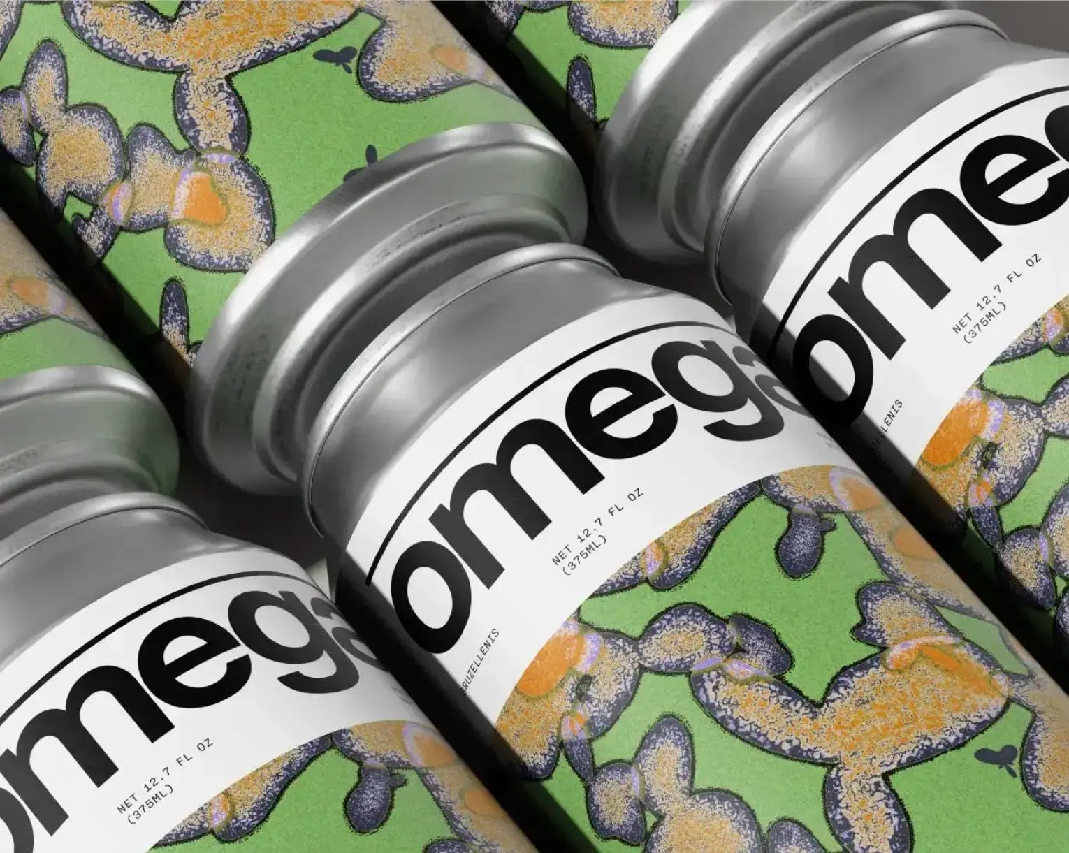
The team used data to shape, color, and distort each illustration, connecting the expressive artwork to the product inside. But the illustrations couldn’t explain everything. Clear labels, color coding, and carefully organized type helped brewers navigate the range. “It’s quite similar to technical outdoor gear in that way, where the functional details aren’t something you try to hide; they actually become some of the most distinctive parts of the design,” notes Pogozzov.
Just as a well-designed piece of equipment helps someone find the right pocket or adjust the right strap, the packaging helps brewers find the information they need. It can catch the eye while staying easy to use.
“What I find interesting is that ‘outdoorsy’ as an adjective used to mean something more crunchy granola, trees, kraft paper, Patagonia, whereas gorpcore now seems to encompass a much more techy, almost sci-fi visual language too,” notes Goodspeed. “The tech-forward side overlaps with what I’ve called automotive normcore: technical, very detailed and layered, but in a brutalist kind of way. I think right now we’re sort of somewhere in the middle of that matrix between different types of ‘outdoorsy,’ basically.”
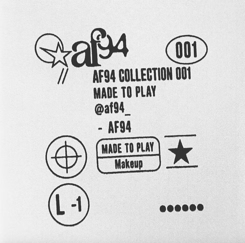
But what about the people designing it? Pogozzov says several team members enjoy hiking, climbing, and other outdoor adventures, so they appreciate how technical gear brings function and style together. “We leaned into that contrast where something expressive sits alongside something highly systematized.”
This approach might also resonate with shoppers. People increasingly want food to do something for them, whether that means adding protein or fitting a particular diet. The International Food Information Council’s 2026 Food & Health Survey found that 70% of Americans actively tried to include protein in their diets.
Goodspeed notes, “There’s been a real shift toward marketing products in terms of what they do for the consumer: protein-rich, low sugar, GLP-friendly, etc. More people are also shopping according to dietary restrictions or preferences—gluten-free, vegan, whatever. Those are all very function-oriented markers to communicate, so it makes sense to me that designers are looking to visual worlds that also originate from function.”
So, are designers’ outdoor wardrobes making it onto shelves? Quite possibly, though the route is unlikely to be as simple as jacket to mood board to finished pack.
“Visual cues in society are always cross-genre. See: everyone wearing Everlane and elevated basics in the 2010s coinciding with peak blanding. So, yes, if gorpcore is in style, ergo, it’s in design,” Goodspeed shares. “It offers brands a way to communicate premium-ness through utility rather than luxury. Instead of ‘this is expensive because it is refined and pretty,’ the message becomes ‘this is expensive because it is engineered.’ That idea seems like it could be especially useful for products trying to position themselves as high-performance like David, Magna, Small Act.”
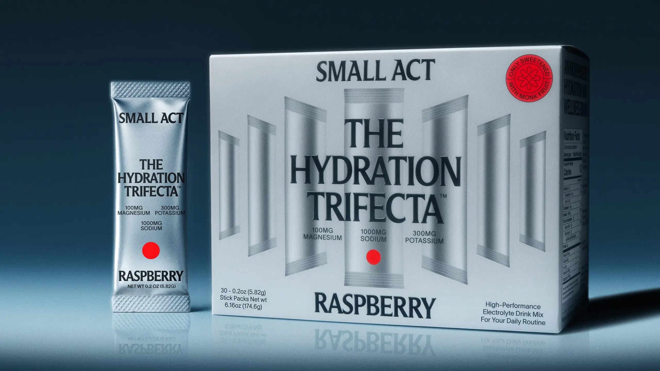
Maybe what we wear does shape what we design. Or maybe the same part of a designer’s brain that loves a perfectly placed pocket also loves a beautifully organized label. Either way, with Salomon seemingly becoming part of the unspoken studio uniform, it’s hard to imagine all those colors, cords, and technical details not finding their way into designers’ heads. And eventually, their work.
When your brain is trained to notice every little detail, the shoes under your desk are bound to give you ideas.
Until next week,