

Does looking like it survived the Great Depression make your packaging the most aspirational?
Actually, maybe.
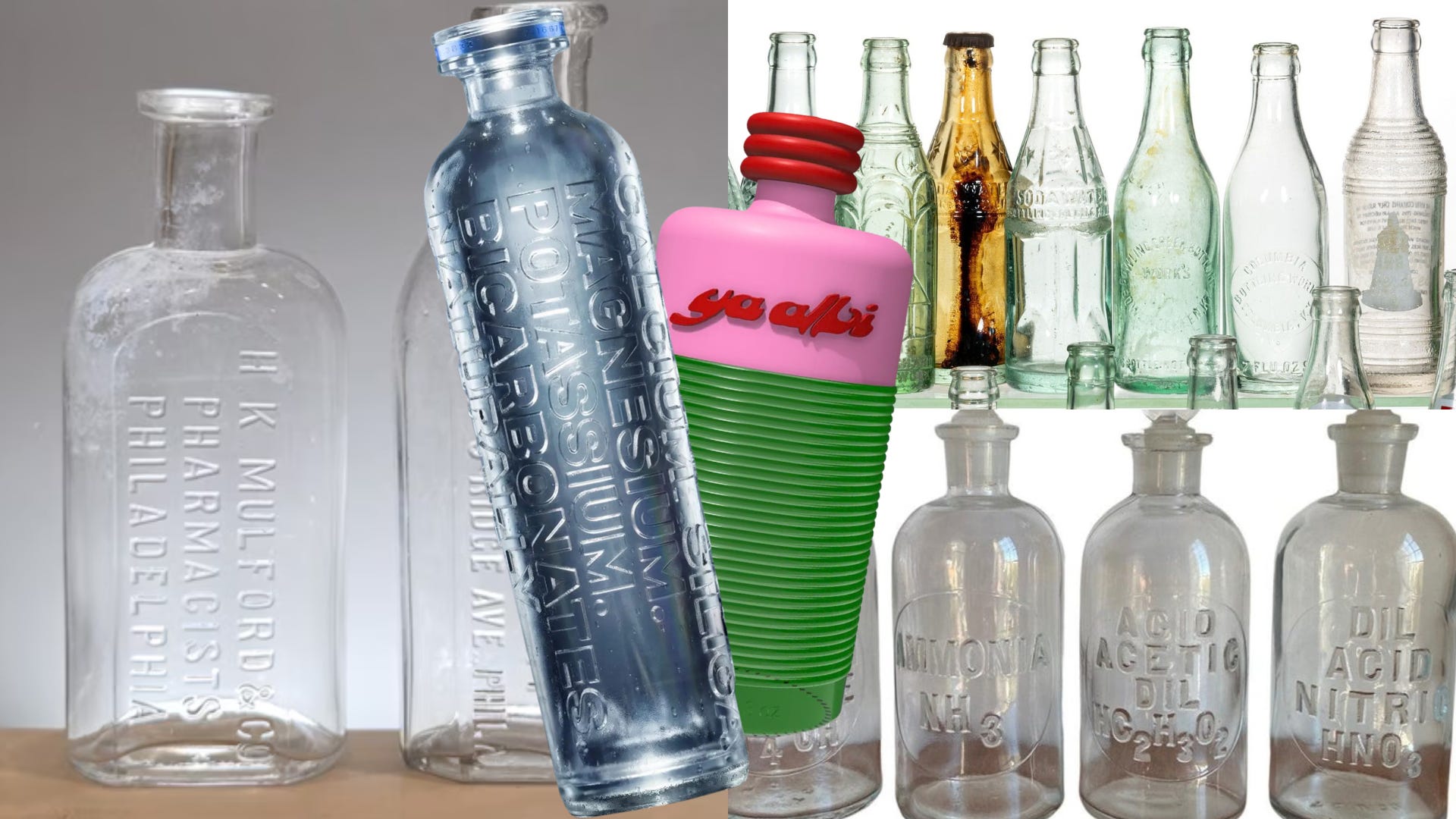
Your first thought might be to ask what that even looks like. Well, picture a label-free embossed glass bottle that lets the raised logo do all the talking. There’s certainly no QR code begging you to “scan for our story” or follow the brand on Instagram, TikTok, and Snapchat. Just embossed letters catching the light in the glass at just the right angles and daring you to pick it up and turn it over, which, of course, you will, if you have good taste.
Embossed glass packaging is currently having a moment within the luxury CPG space, even though the design techniques come from 200 years ago, not to mention that it’s more expensive than ever.
Which is just luxury branding in a nutshell. It’s more desirable because it’s an inconvenience.
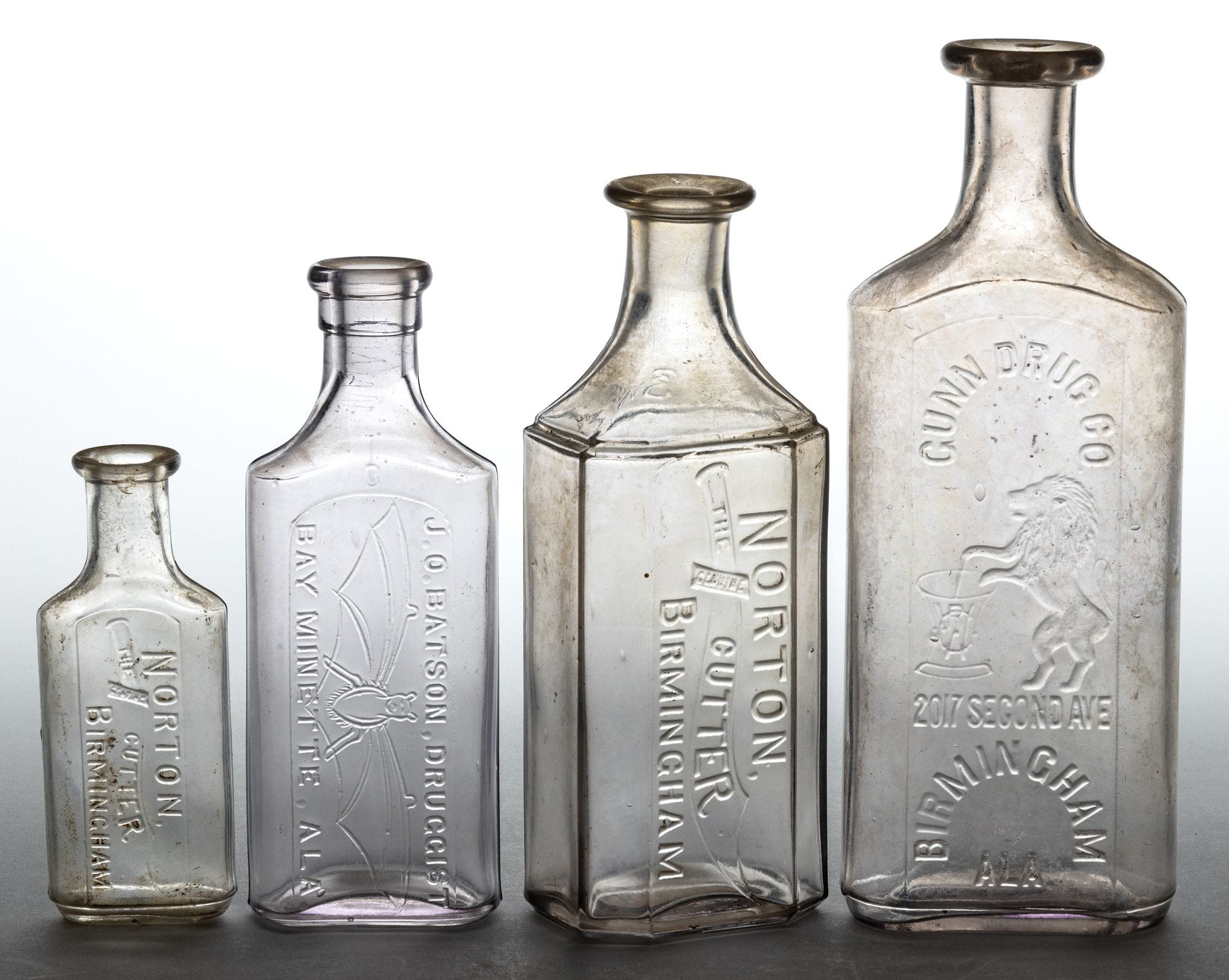
Before paper labels became the norm, embossed glass bottles were the standard. Pharmacists in the 1800s embossed their names on medicine bottles, an early, durable form of advertising. Dairies also pressed their name and town into their milk bottles along with verbiage like, ”This bottle is the property of the above / It is loaned and cannot be legally used by others.” Because, afterall, bottles used to be returned and reused, a smart (and sustainable) concept we can’t seem to fathom now.
Soda bottlers also embossed the brand name, and according to Bill Lockhart’s chapter for the Society for Historical Archaeology, embossing was the most common way soda bottlers labeled their bottles, even though paper labels were used earlier. “Paper labels were inexpensive, easy to apply, and contained complex advertising messages,” they stated. “The major drawback, however, was that the paper tended to wash off when bottles were cooled in buckets or barrels of ice – the only medium then in general use for cooling soft drinks.”
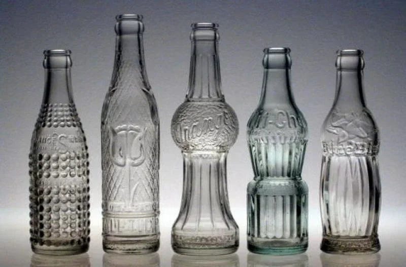
A bottle had to survive years of reuse, ice water, and handling by people who were, kindly, not gentle. Embossed glass packaging of the past wasn’t necessarily done for decorative purposes. Instead, it was a logical choice.
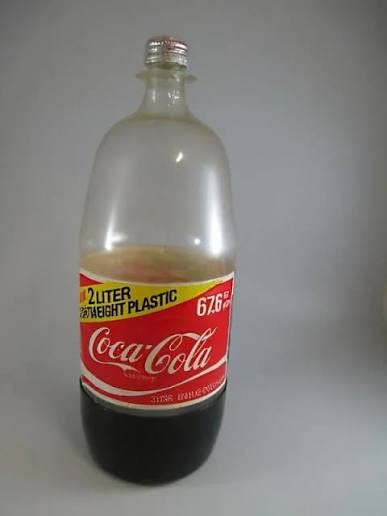
Paper labels were already the norm by the 1910s, and then in 1978, when Coca-Cola and Pepsi rolled out the first 2-liter PET bottle, plastic packaging became the standard. It was light, unbreakable, and absurdly cheap to produce at scale. Plastic replaced the entire philosophy of packaging, from “built to last, built to return” to “built to be forgotten in a recycling bin five minutes from now.” Nobody needed a glass bottle engineered to survive many trips back and forth from the dairy. We’d entered the golden age of disposability.
And yet, I’m seeing some new brands launch with embossed glass packaging. Nothing about embossing has gotten easier, faster, or cheaper since 1975. So why are luxury brands running headfirst back to it?
I called up the designers behind Madison Blue Water, a premium water brand designed by Makers & Allies, as well as the founder of Ya Albi, an olive oil brand that just spent over a year getting its own embossed bottle into the world, to find out.
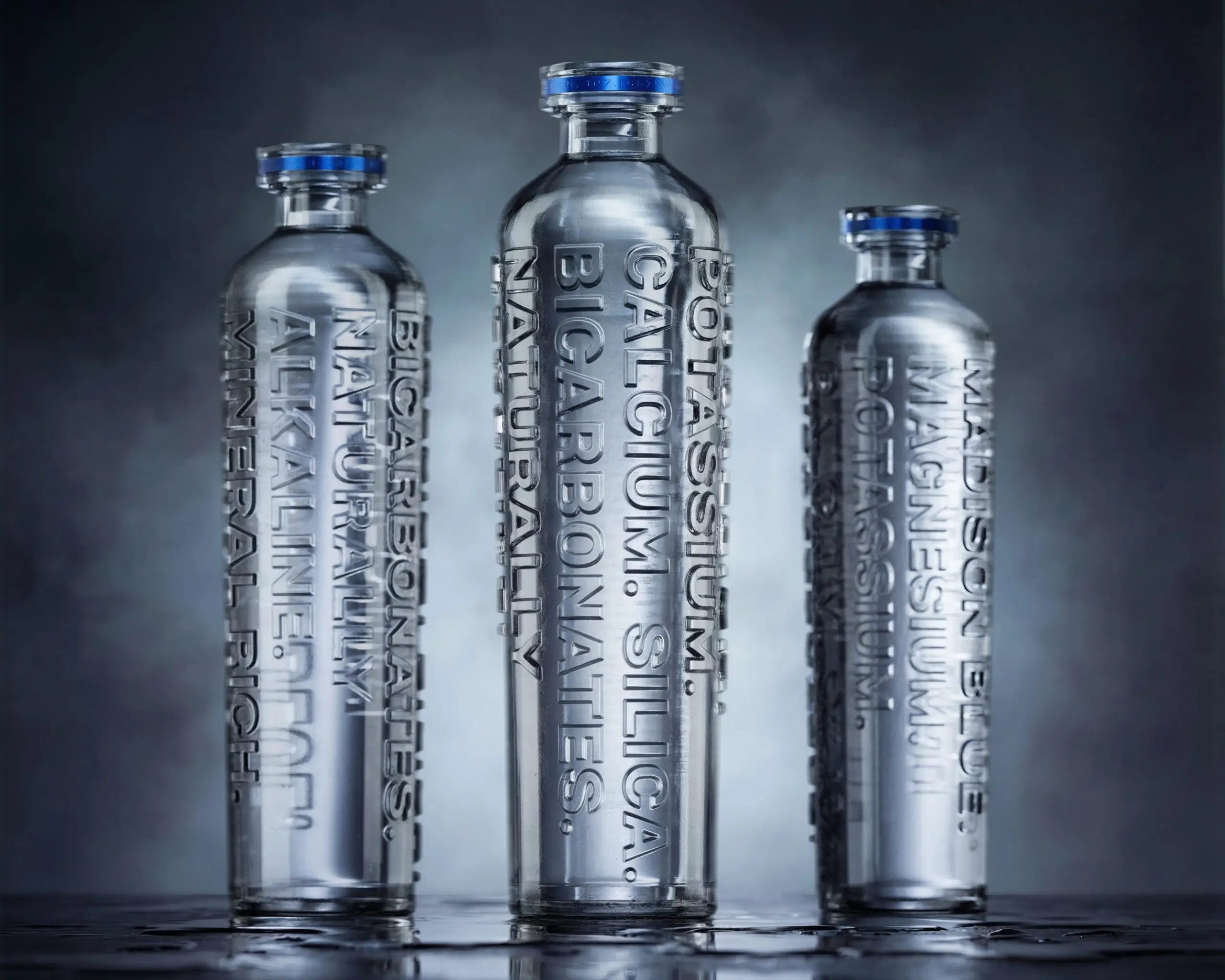
“We didn’t want to create another premium water brand that relied on a beautiful label to communicate luxury,” Garrett Deiter, Founder and CEO of Madison Blue, told me. “We wanted the bottle itself to become the brand, something distinctive enough to recognize across a restaurant or on a shelf without reading the name.” The embossing traces the water’s naturally occurring minerals, a literal, physical link to the brand’s whole thesis, “the minerals that built America.” Glass keeps the water visible, untouched by plastic. “There’s something powerful about that transparency,” Deiter said. “The bottle is bold, but it has nothing to hide.”
This is, structurally, a strategist’s dream and a production team’s nightmare. “Once the identity becomes part of the glass, design and manufacturing have to work together much earlier,” Deiter explained. “Typography, embossing depth, legibility, bottle structure and production tolerances all become interconnected. There’s less flexibility than designing a label, but those constraints can make the work stronger. You’re not simply designing graphics for a package, you’re designing the object itself, so every detail has to earn its place.” Every millimeter, accountable. You can’t just change your mind six months later. You either commit now, or you don’t get to commit at all.
That kind of forced permanence is something we need more of in the CPG space. Rebrands and design refreshes almost don’t feel all that exciting anymore because they’re happening at an unparalleled rate.
But when there’s a sense of intention, consumers certainly notice. “People want to pick it up,” Deiter told me. “They want to turn it around and learn more. Without a conventional label telling you exactly where to look, the bottle creates a sense of discovery.”
I asked whether the design thinking was about sustainability or luxury positioning. “Both, and I think the most successful packaging decisions can accomplish those things together.” Glass keeps the water uncontaminated, unlike plastic, which can leach chemicals into the product over time, glass doesn’t react with its contents; it’s recyclable, and it gives the brand the weight and permanence luxury objects are supposed to have. Going label-free pushes that idea further, stripping away rather than adding, and trusting that restraint reads as more expensive than decoration ever could. “There’s a shift happening in luxury,” Deiter shared, “where restraint can communicate more value than decoration.”
Madison Blue treats embossing as a brand philosophy, and Ya Albi’s founder, Yasmeen Abouremeleh, treats it as something of a personal promise. “The embossing was part of the vision from day one,” she told me. “We wanted the packaging to have the same sense of quality and care as the olive oil itself. Everything else we saw felt very flat and two-dimensional, and we wanted the bottle to feel more permanent, like an object you would want to keep rather than packaging you immediately throw away.”
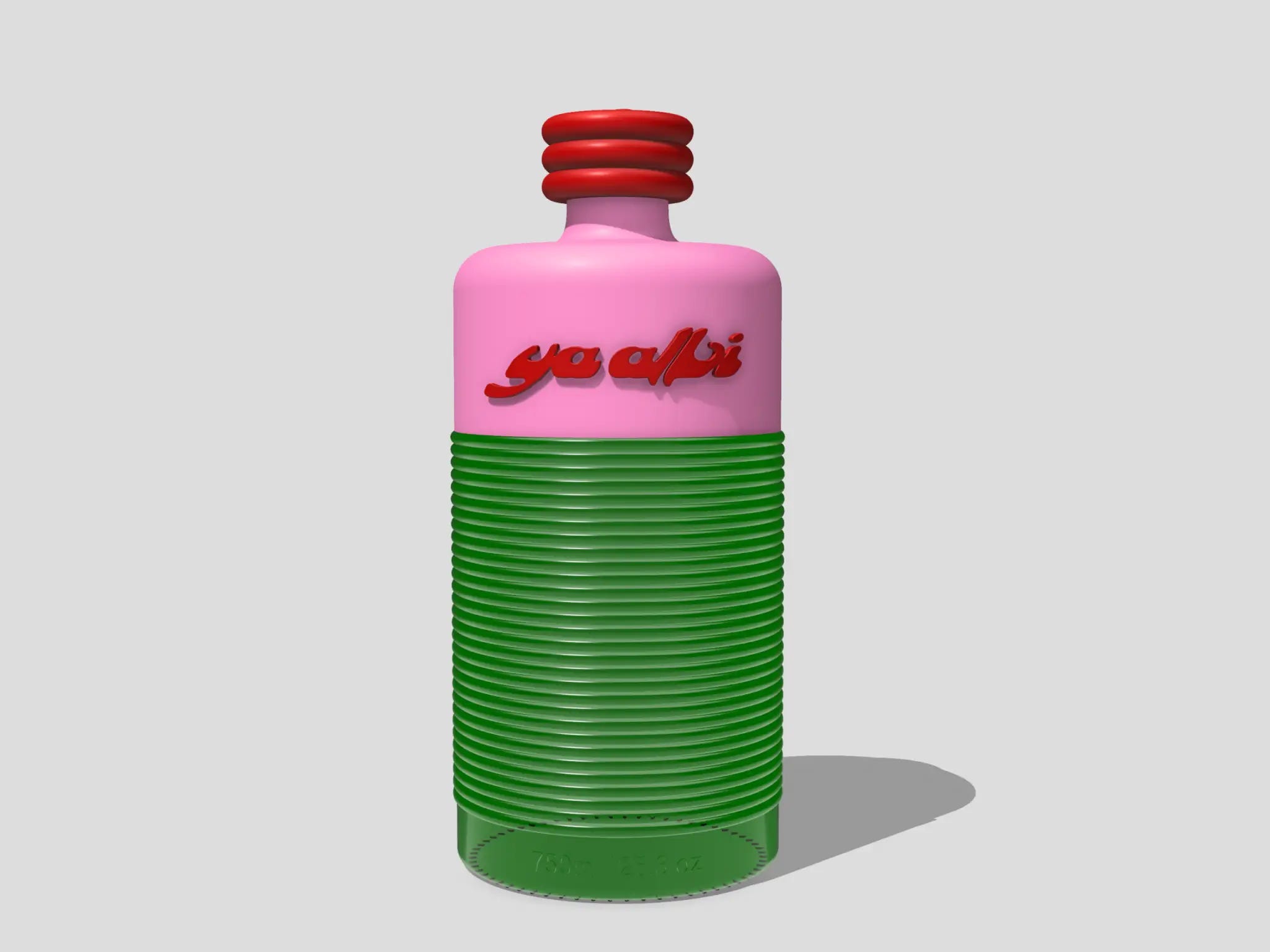
The phrase “a love letter to Palestine” is embossed directly into the bottle, in both English and Arabic, alongside the logo and “Product of Palestine.” It’s not a temporary sticker just slapped on. “Those weren’t decorative afterthoughts,” Abouremeleh said. “They were built into the object from the beginning.” It’s there permanently, whether it’s convenient or not.
Her framing of the investment stuck with me the most. Developing a custom mold and committing to a minimum run of 10,000 bottles, Abouremeleh said, is “almost like the difference between fast fashion and something made slowly and thoughtfully.” Which, yes, but it’s also, candidly, a financial commitment most brands simply cannot make upfront. That hint of initial inaccessibility is part of what makes this viable for exclusively higher-end brands, whether or not it’s intentional.
But even more than a price tag, embossing forces permanent decisions, and permanent decisions are one of the main things modern branding seems to avoid. The entire industry of rebrands, seasonal packaging, A/B tested labels never has to commit to anything for too long. Embossing turns it all upside down.
Ya Albi initially tried designing the bottle without letting regulatory copy dictate the form, only to run headfirst into the very unsexy reality of nutrition panel size requirements and legal copy placement rules. Their fix was to keep that information in a small, printed, changeable area rather than lock it into the glass forever. “We didn’t want information that might need to evolve permanently molded into the glass,” Abouremeleh said.
“Once the mold is made and the production run is committed, you are locked into that design and those units,” she told me. “We had to be extremely confident before moving forward.” They went through iteration after iteration, shape, proportion, embossed depth, and were deliberate about which elements got to be permanent and which stayed flexible. “Every millimeter mattered. We loved the final design, but we were careful to make only the timeless elements permanent.”
Embossed glass won’t trickle down to the mass market, not because consumers wouldn’t want it (they clearly do; nostalgia sells, permanence sells, etc.), but because the economic model only makes sense at the top of the price ladder. Everything that makes embossing meaningful is also what makes it impossible at volume. For a value brand, that permanence is a liability, but for a luxury brand, it’s the game. We are, it turns out, suckers for things that feel like they’ll outlive us. At least I am.
I’d expect the categories to keep expanding. Spirits, fragrance, and high-end pantry goods all feel like the obvious next stops, especially as more brands chase what Madison Blue called “an ownable physical gesture that creates recognition before someone even processes the logo.” But I don’t expect it to go mainstream, and I’d argue it can’t, really.
Both Deiter and Abouremeleh, unprompted, ended on the same advice: don’t do this because it’s trending, do it because you actually mean it. “I wouldn’t tell every brand to drop its label,” Deiter said. “Label-free packaging is only powerful when the bottle has a strong enough concept to stand on its own.” Abouremeleh’s version was more rooted in logistics: “Be patient and trust your instincts. Before investing in the final mold, physically test everything.” You’ll also want to vet your manufacturer early, as she switched hers mid-process after the quality fell short, and accept that some days you’ll want to quit before it clicks. “There were several points when I felt stuck,” she admitted.
There’s a reason why “polyester” is an insult right now; hopefully, “plastic” is next.