

In most modern branding, a designer or agency has been hired to make things look beautiful and intentional. Letters should be perfectly kerned, and colors should be thoughtfully calibrated. Not to mention that logos should be highly refined and work in both digital and physical media. But now, perfectly polished design is expected, whether it’s tinned fish and deodorant or car logos and buckets of paint. Good design is now table stakes.
Perfection, while strived for by most, can also be boring. And now, especially, the lack of evidence that a human being was ever there at all is of concern. Increasingly, brands are turning to an unlikely creative partner.
Children.
Kids’ handwriting is becoming typography, and their doodles are becoming illustrations. Their lack of knowledge of virtually every principle of good design has become sought after. Kids are the creative directors now. Or at minimum, they’ve been given a seat at the table.
Of course, “childlike” design has been a working genre for years. We’ve been seeing the wonky type and the scribbled illustrations for a while. But instead of asking an agency to take inspiration from the look of a kid’s drawing, brands are handing a child the marker and stepping back.
“There’s a rawness to it that is very hard to manufacture. So much branding right now is incredibly manicured, and increasingly, with AI, we’re surrounded by things that have been optimized into a kind of visual perfection. A kid’s drawing does the opposite. It’s unstudied,” notes brand strategist Nikita Walia. ”The proportions are wrong, the handwriting is inconsistent, there’s no self-consciousness about whether something is ‘good design.’ That becomes incredibly arresting in a feed where almost everything else has been designed within an inch of its life.”
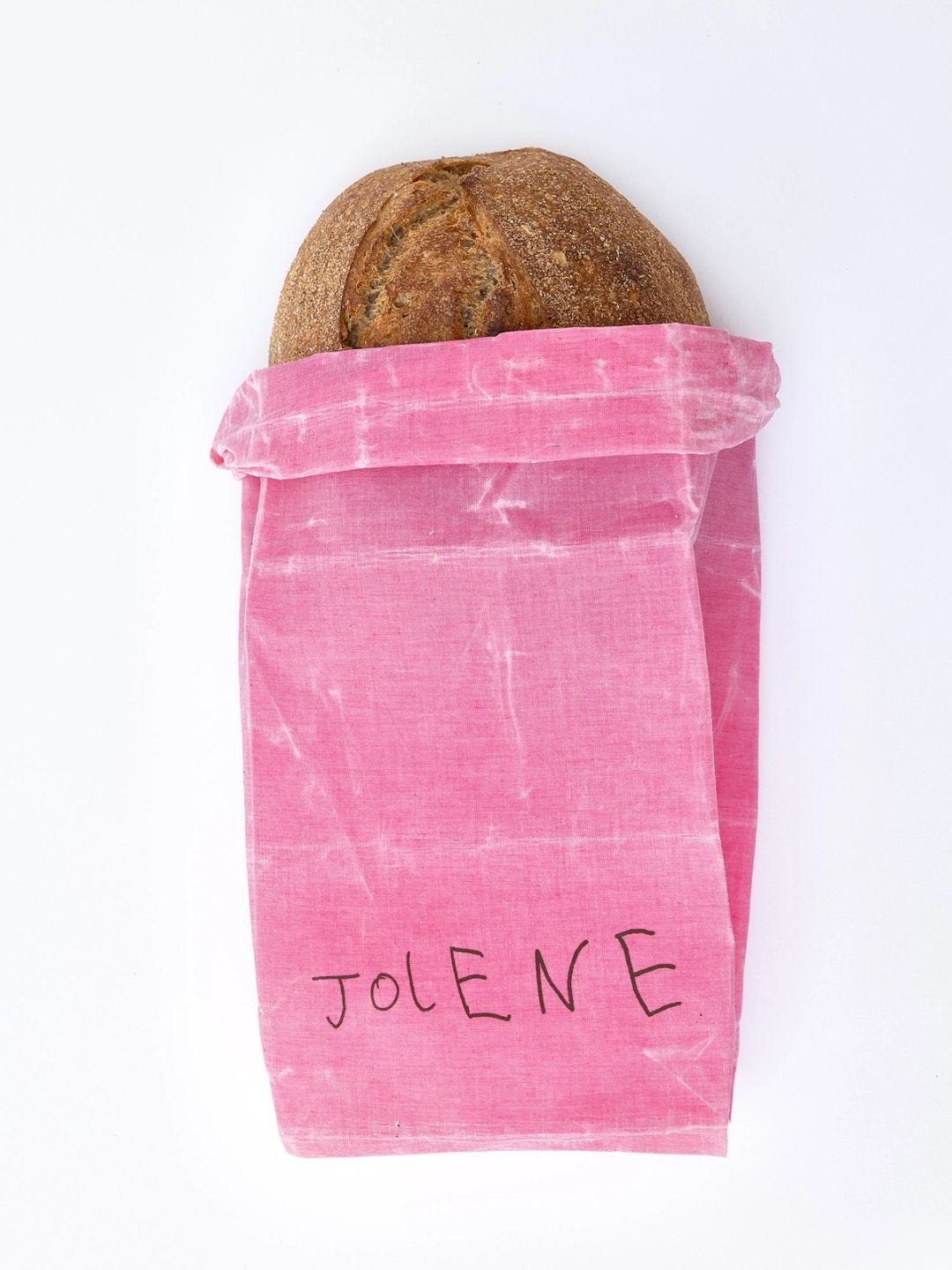
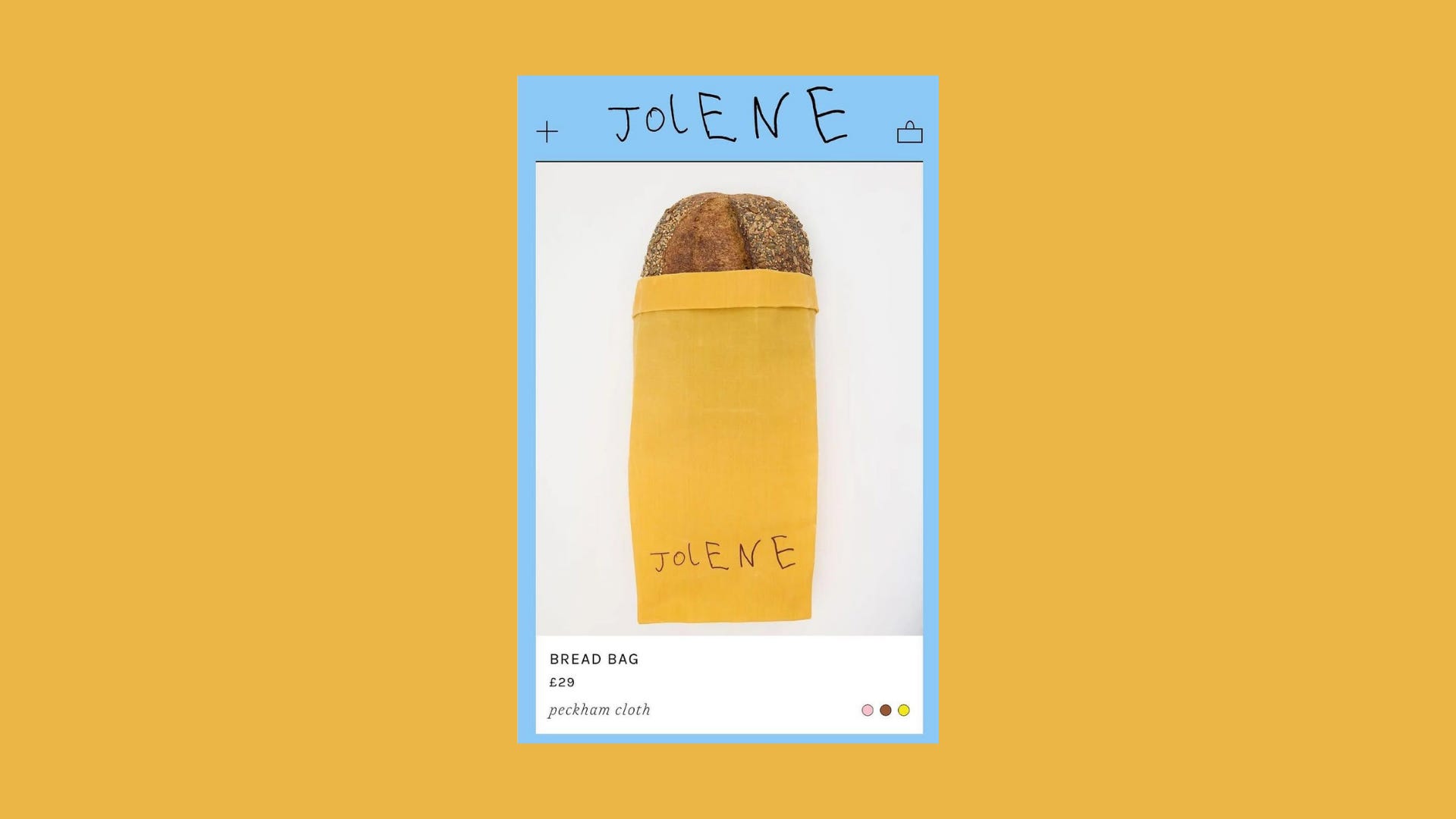
Jolene, the cult London bakery-restaurant, for example, got its wordmark drawn in 2018 by Studio Frith founder Frith Kerr’s then-six-year-old son. It works because the whole point is for it to look like a work in progress. Jolene is upfront about this on its own site, describing its commitment to sourcing from responsible farmers while conceding that “the system isn’t perfect, and neither are we.” The brand owns its imperfections, and a wordmark that looks unfinished, drawn by a child still learning to write, is a visual cue of all of it.
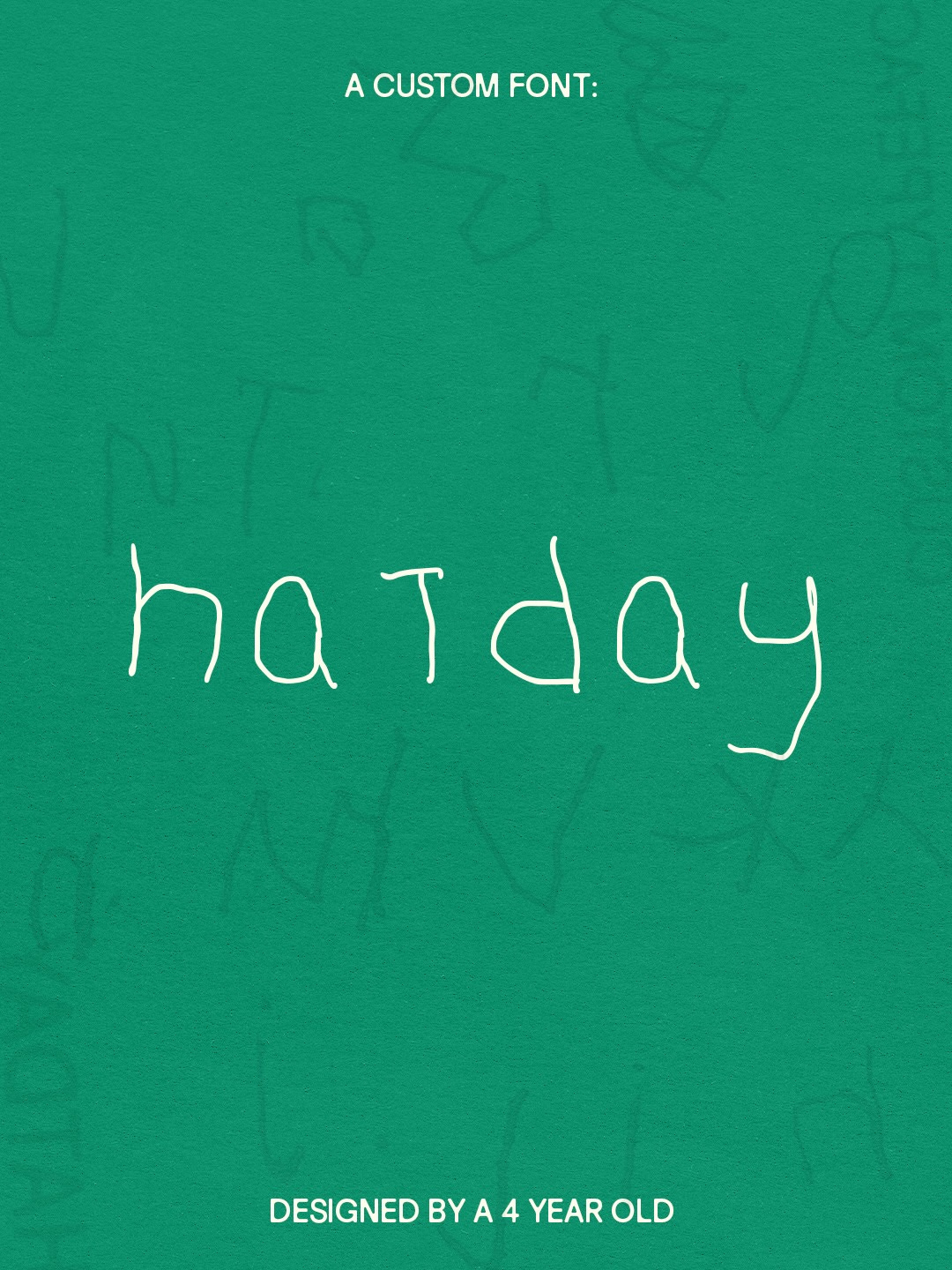
Then there’s Luma, an Australian kids’ sunwear brand, which offers a version of this where the idea genuinely outruns the aesthetic. The brand was inspired by, and named for, the founders’ sons, Luca and Max, so when it came time to rebrand, the studio Anotherside brought Max in directly. His handwriting became a secondary logo and the seed of Hatday, a custom typeface that preserves every inconsistency of a child’s handwriting. Even the illustration system borrows from the angular, slightly deranged way small children render shapes.
Chloe Gordon, founder of Anotherside, shares, “Introducing imperfect, wonky and human typography to the identity wasn’t just something we added because it looks good on a moodboard. There was a reason it was part of the design system as a whole. For a brand built entirely around protecting young skin, we didn’t want the typography just to be an approximate representation of a child’s writing; we wanted it to truly honor the way kids write, inconsistent kerning and all.”
“Childlike” typography can be faked, sure. A designer would be able to create something similar to a kid’s handwriting or doodles, and they have, but when there’s a real story behind the child who’s creating the design, there’s soul. We know, as consumers, that even at a designer’s most deliberately loose, they are composing, editing, and correcting a line that’s drifted slightly too far left. They know precisely which rule they’re breaking. It’s imperfect, but it’s perfectly imperfect. But there’s almost always a sense of magic to a kid’s overly spaced, wobbly letters. And, right now especially, we’re all craving this sense of unbridled childlike freedom. This is that, just visualized.
Children likely don’t know a grid exists, and they wouldn’t care if they did. To them, a letter is huge because it wants to be. An “E” gets six horizontal lines because three felt insufficient. A person’s arms emerge directly from the head, no neck required. Kerning is not a word they’ve ever heard. And the second a designer tries to look accidentally childlike, the whole thing stops working.
Technical polish has become embarrassingly easy to produce. A dozen logos can be generated in five minutes. But the imperfections we used to sand away have started to function as a proof of life. Evidence that a human being was present and thinking—and not just any type of human, but a child, full of whimsy, passion, and naivety—means more. There’s more soul to it.
“I don’t think it’s a coincidence that this is happening at the same moment we’re experiencing such a massive output of AI-generated creativity. Technical perfection is now incredibly easy to manufacture; you don’t have to be skilled to produce work at that level these days. The things that used to be considered mistakes and serve as proof of a lack of skill now almost function as proof of human life,” notes brand and growth strategist Alexandria Sofie Wartell. “Childlike creativity is at the opposite end of that spectrum; kids don’t refine; there is no ‘correct’ way to produce something. They just do. There is a raw, instinctive energy to their process (if you can call it that), and people are desperately craving it. Even culturally, I see more and more commentary on the relief people feel when they find mistakes in creative outputs, whether written or in other formats; it reassures them that a person, not a machine, was behind it. Messiness has become a new way to communicate authenticity, and I think brands are clinging to it because it gives them access to that sense of humanity in its most unfiltered form.”
Which makes a child’s drawing an obvious pivot to this exact cultural moment. Children do not optimize, and they certainly do not prompt. They draw a circle with eleven rays coming off it at odd angles, and color half of it blue because the yellow crayon was missing and they got bored in the middle of coloring.
Even outside the explicitly kid-focused world, that same rawness is present. Radford Beauty‘s identity, designed by Day Job, leaned on founder Victoria Radford’s own handwriting and drawings rather than the glassy, over-polished visuals that have run the beauty aisle for a decade. No child was involved, but the instinct was the same. “At the time, particularly in beauty, it felt almost subversive because everyone else was trying to look so polished,” shares Walia. “I think kids take that same instinct even further because you genuinely cannot art-direct a seven-year-old into perfect imperfection.”

Consumers are increasingly aware of the typography used and Pantone swatches. Wobbly lines and handwritten scrawl read as proof of a human hand, and, by extension, proof that a real person actually made a decision rather than a committee optimizing for shelf appeal. The handmade logo isn’t just there to be “cute” so much as to help humanize a brand.
It’s resonating right now, especially with brands targeting adults, because it inherently feels more relatable. In packaging and branding specifically, this human-led design style is helping brands communicate their ethos, especially for products that prioritize authenticity and transparency without having to spell it out. A brand can say, “we believe in the power of human connection” a million times in marketing collateral, but the second they scribble “go outside” in human handwriting on their packaging, it actually means something.
And even luxury brands not only deserve to be humanized but are appreciated when they are. A few years ago, Chanel created a Mother’s Day campaign featuring children’s drawings of the brand’s most well-known products. The children of Chanel employees drew the art. The campaign was widely praised and became a viral case study in luxury marketing. The children’s drawings conveyed the message of joy and unconditional love quickly, without any need for explanation. It’s warm and fuzzy without any underlying sense of cliché.

Cheerie Lane Popcorn, the Iowa popcorn brand, is built on family and a fifth-generation farm. Its founder folded her own children’s drawings directly into the design, and her kids also helped hand-paint the notecards that go out with samples. Here, the drawings are a natural extension of a world already infused with family, ritual, farming, and a shared bowl passed around a room during a family movie night.
There’s something refreshing about brands simply admitting that children have a point of view worth consulting, rather than adults endlessly manufacturing “kid culture.” Plus, everyone is talking about nostalgia, but there’s something unexpectedly nostalgic about the artifact itself. The more childhood gets painted by algorithms, the more revolutionary a badly drawn dinosaur starts to feel.
“Marketing has spent the last decade becoming incredibly enamored with big data: behavioral data, social listening, dashboards, increasingly synthetic audiences and synthetic data. All of that can tell you an enormous amount, but as more of the inputs themselves are modeled or AI-generated, I think genuinely human observation becomes more valuable, not less,” Walia shares.
She continues, “At the same time, every brand now seems to want to be “in culture.” But culture is very difficult to understand entirely through a dashboard. At some point you actually have to talk to people, watch what they do, hear the language they use, and understand why they make the choices they make. So I don’t think it’s a stretch at all to imagine kids moving further upstream, whether that’s helping choose flavors, naming products, reacting to concepts, or shaping what gets made. Consumer brands were already doing versions of this in the 2010s with millennial councils and consumer panels. The difference now is that direct access to real human taste may become a competitive advantage again.”
Performative childhood typography or illustrations likely isn’t the next wave in branding and design. That said, bringing in a raw, human POV, even—but especially if that human is six—might just be.
Until next week,