


Protein, protein, protein.
It is all anyone is talking about, and I say that as someone who also talks about it, professionally speaking, that is. And while this doesn’t necessarily concern protein, it’s, as they say, in the room with us. It’s really about a redesign, and one that took place almost right after the brand officially launched.
The refresh, actually, is the part I can’t stop thinking about.
But let’s back up for a second. For the past few years, plant-based meat alternative brand Beyond has been critiqued from every conceivable angle, and rarely for the same reason twice. Health commentators zeroed in on the ingredient list, flagging additives like methylcellulose and refined oils, and the products landed in the ultra-processed bucket that consumers have learned to distrust. Harvard’s Chan School of Public Health pointed to that ultra-processed classification, and its links to poorer health outcomes, as a plausible reason plant-based meat sales stalled. There was even a lawsuit over protein claims, settled without an admission of wrongdoing, alleging that the company’s testing method overstated the protein’s quality.
Then there was the business press. In 2025, the stock fell by 78%, and analysts agreed that meat-eaters preferred actual meat, while vegans wanted cleaner labels than Beyond could offer.
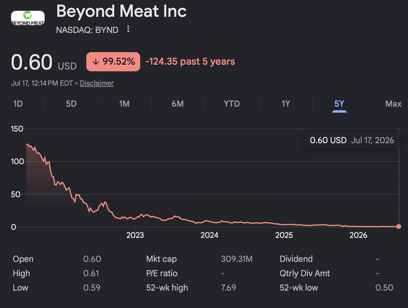
So, it all makes perfect sense why Beyond ditched the “Meat” portion of its name in March of 2026. “Meat” was the problem in every direction. It invited comparison to the real thing, a comparison that Beyond kept losing on price and taste. And consumers decided that imitation was the least trustworthy thing food could do. Protein, meanwhile, is the one nutritional word in America with no enemies. Everyone wants more of it.
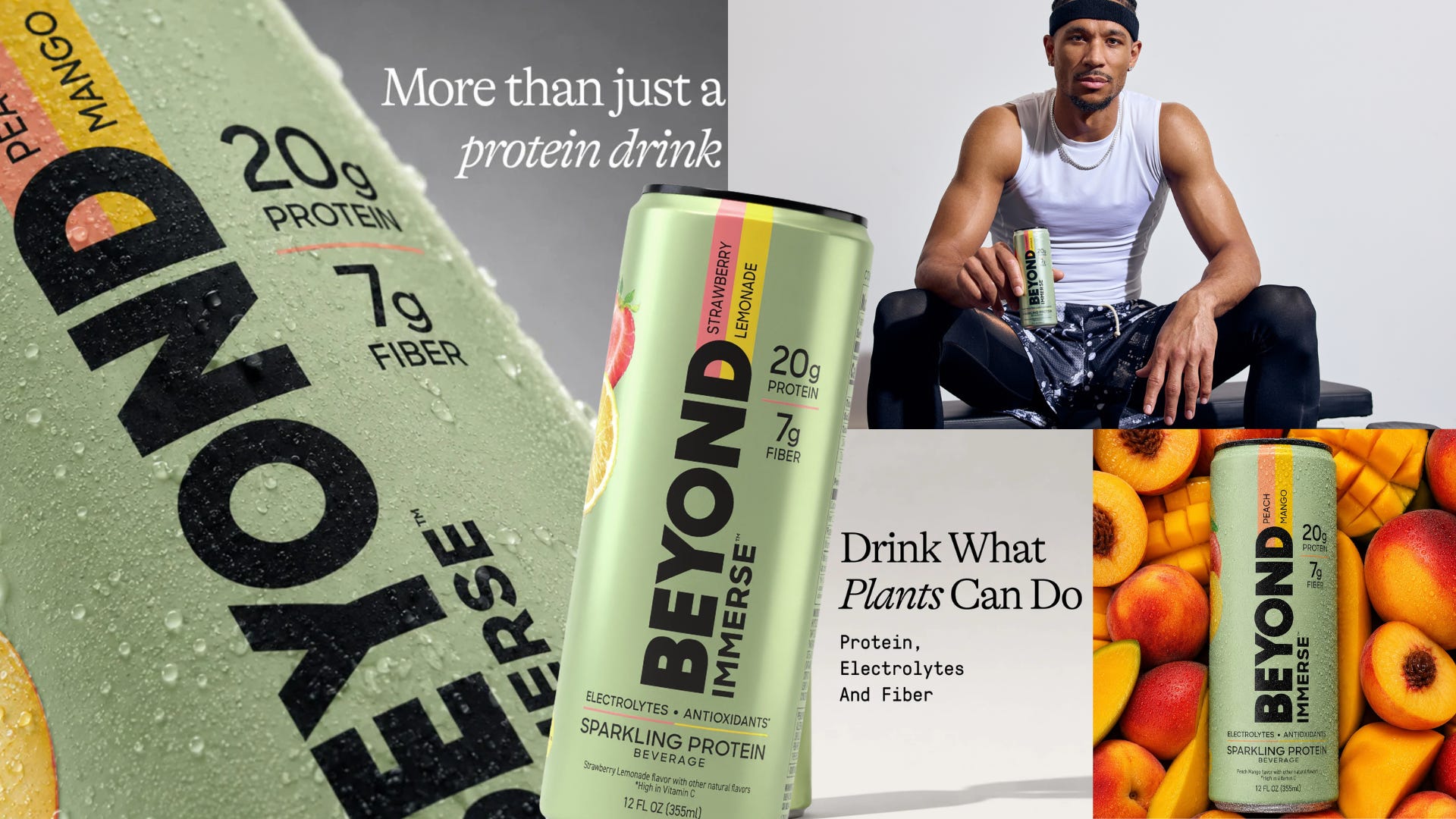
And thus, in January, Beyond launched Immerse, a sparkling protein drink, its first beverage ever. By June, the can had been entirely redesigned, top to bottom, in what took about three weeks. Which, in redesign time, is roughly the speed of light.
And the question that kept me up after I got off the phone with Paula Grant, founder of Suite9C, the studio behind the redesign, is not whether the new can is better (it is), but whether the design was ever the real problem at all. Because, at the end of the day, they are a plant-based meat company that, stay with me here, asks people to…drink their product.
Is any amount of design able to fix that perception? Or will the first association to the brand always be “meat?” Err, “not meat.”
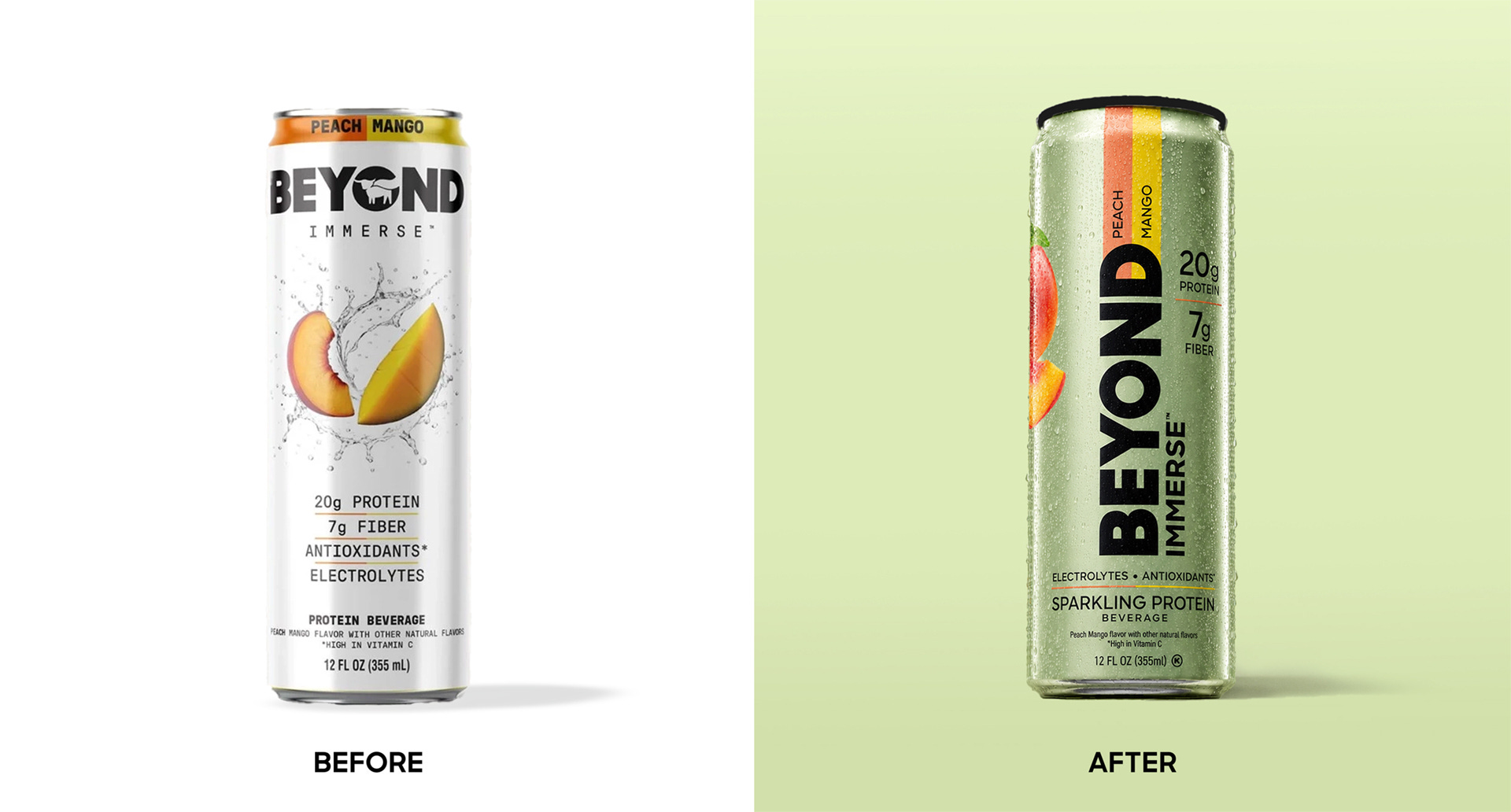
If we do a design autopsy on the first can, we’ll find a white canvas, fruit imagery front and center, mid splash, hovering above a stacked column of claims. Every design decision clearly traces back to a very literal interpretation of the product. It is light and sparkling, so make it white. White Claw is a great example of this within the sparkling spirits space. There is a fruit flavor, so show fruit. A la Tropicana. It should seem refreshing, so add a splash. Much like Capri Sun. It’s all so painfully obvious.
Grant, the designer behind the rebrand (her resume includes founding roles at Core Water and BODYARMOR, so she knows her way around a beverage), was very gracious about this when we spoke, which somehow made her diagnosis land harder. She describes it as the instinct of a company that comes from food, where packaging exists to describe what is inside rather than to build an image around it.
“It’s almost like if you were to put it into a student brief or ChatGPT, and have it spit out exactly what you think it’s supposed to be. That’s what they did without any kind of image or panache,” Grant shares with me.
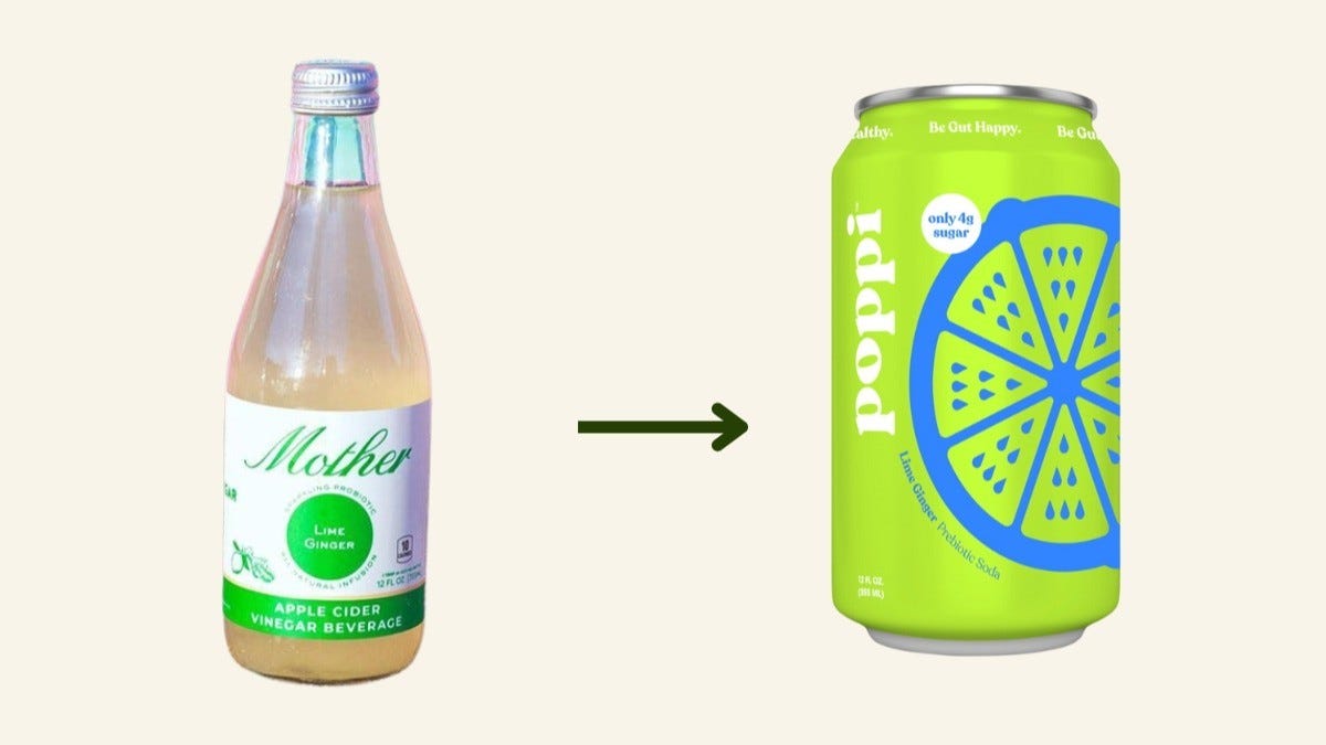
She compares the beverage industry to perfume, products where image does nearly all of the work, and points to Poppi as the pinnacle of a brand that had to learn, expensively, the difference between selling a product and selling a brand. Grant notes, This is true of many entrepreneurs I meet who are new or don’t get it. You can see Poppi’s evolution. It started as, ‘This is apple cider vinegar. This is what the product is. This is what it should look like.’ At first, they made the mistake of selling a product and not a brand. It’s a little bit of a learning curve. That was [Beyond’s] mistake: they’re used to developing products, not brands.”
The verdict on can number one did not come from design Twitter or Instagram comments. It came from Big Geyser, New York’s dominant independent beverage distributor, the operation that helped build Vitaminwater and Poppi, and an institution that knows exactly what survives a bodega. Ahead of its trade show for the city’s deli buyers, Big Geyser looked at the white can and concluded it wouldn’t make it. Grant shares, “Beyond was used to developing products and not brands. For the first design, they were less worried about creating a really great brand and image, and were very literal about what exactly the product is.”
One phone call later, Grant was on the clock. Three weeks later, the brand had a full redesign and a trade show booth. Companies typically do not move this quickly, but it tells you how seriously they took the judgment.
Essentially, the brief was “fix it.” And fix it now.
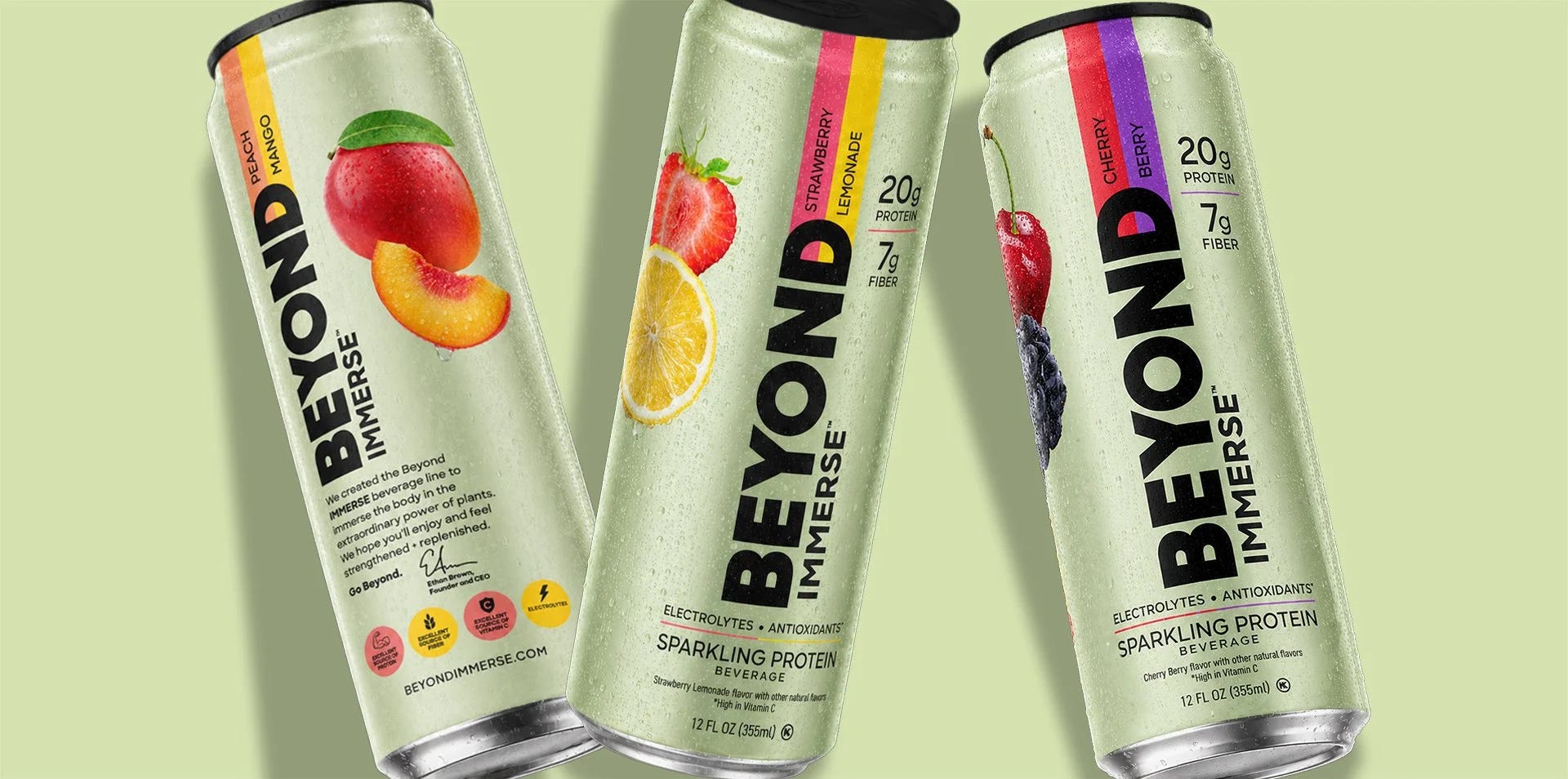
The new can, now rolling into more than 26,000 New York outlets, is much better. The wordmark runs enormous and vertical in black across a light metallic green, a shade calibrated to Beyond’s portfolio without shouting AG1. The fruit survives along the edge, deliberately restrained, because protein drinks carry mouthfeel baggage, and a can dripping with peaches promises a thickness this formula was engineered to avoid.
“When you asked why there isn’t a lot of fruit on the front, it’s because they have athletes like Josh Hart, and it’s got to look good in his gym bag or with him holding it,” Grant shares with me. “He looks cooler holding something that looks like a health accessory versus a Hint bottle, right? You take all of that into consideration, and then we start iterating on the design and creating mood boards. All of that thought is very strategic.”
But the most telling part of the redesign is what disappeared.
Beyond’s brand mark, a little silhouette of livestock, was featured on the original can, but on a plant-based drink, it is a liability twice over, suggesting dairy at best and meat at worst. When Grant raised it, the client reached for the obvious counter: that nobody who drinks Red Bull thinks they are drinking a bull.
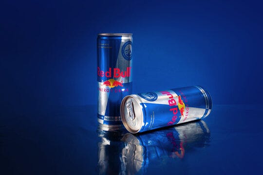
Grant laughs when she tells me this, “I was like, yeah, I think that’s a little bit different. They don’t see that they don’t see packages of bull meat in the store.” The bull is a perception problem. Not for the brand’s hamburgers or chicken, but absolutely for its beverages. Beyond spent years educating consumers that its name means plant-based meat, but un-teaching things is almost harder to teach consumers. Grant has worked with brands on similar issues like this before, once spending months untangling Core Bar from Core Water so a snack would not taste like a beverage in the shopper’s head. She also told me about a proposed Speedo water that died because, well, nobody wanted to drink from a swimsuit.
Beyond seems to know all this. But a three-week rebrand is a patch on a question that takes years, and the question is whether we will let a burger company into our gym bags. Design is one thing, but brand perception is another. I’ll be curious to see how long this one lasts.
The new can is smart. It is genuinely, strategically smart. If you handed me the two cans blind, I would pick the redesign every time, and so would Big Geyser and Josh Hart. Grant did exactly what a great designer does, which is to solve the problem she was hired to solve.
But I don’t think the problem she was hired to solve is the problem.
Because when I look at that can, no matter how beautiful, a part of my brain still mutters that this is the company that makes the vegetarian steak filets, burger patties, chicken nuggets, and meatballs. And now they would like me to drink something. My mind, unhelpfully and immediately, starts doing the math on what, exactly, is in the liquid version of a plant-based nugget. It’s not a rational thought, I know that. But it’s also not a thought any redesign can un-think for me, and I don’t think I am alone. Beyond spent a decade and hundreds of millions of dollars teaching America that its name means meat that isn’t meat. You cannot spend three weeks teaching us that it means “seltzer.”
Which is why, if Beyond had called me instead of Big Geyser (they should not, but indulge me), I would have told them to stay solid. Launch something crunchy and stackable that lives in the snack aisle, like chips or puffs, where the leap from patty to product is short, and the texture doesn’t become a problem. A protein puff from a protein company is a line extension. A protein drink from a meat company gives me hesitation.
But at the end of the day, design can only reframe a question. It cannot answer one. And the question, still, is whether we will let a burger company whip up a drink. I know my answer. I’m just not sure Beyond wants to hear it.
Until next week,
I fully agree with you, gorgeous redesign notwithstanding.
It would've been a much more reasonable pivot if they've gone into the snack isle, then maybe into beverages. As a vegetarian myself, I.see a lot of opportunities into spaces like vegetarian/vegan jerky kind of products. On the other hand, there are plenty of high protein beverages, including plant based, from companies that started in that space already. If I was looking at a shelf right now, between Beyond, or let's say, Orgain, I'd probably feel more confident grabbing an Orgain.
In any case, I like the Beyond brand and products, I hope this works out for them.
In addition, neither the brand pivot nor product redesign matter one bit if the product isn't good. And it's... not good, according me (and to everyone else I've forced to try it). I'm curious what long-time brand fans think of the flavor.