

The spirits industry has, historically, leaned masculine.
When it comes to alcohol consumption, men do drink more than women globally, according to the Natinal Library of Medicine. But beyond just who is drinking, alcohol branding has long been steeped in “masculine energy,” shaping how it’s marketed and even how it looks. Advertising has historically leaned on sexism, often depicting women as objects of desire, existing solely for the male gaze—think Canadian Club Whiskey and vintage Miller High Life ads or even the sleek, hyper-sexualized Skyy vodka imagery.
But beyond the ads, this masculinity is embedded in the very design of these brands. The heavy glass bottles, dark color palettes, bold serif typography, and heritage-driven storytelling all signal a sense of tradition, power, and exclusivity, qualities that, for decades, have been coded as masculine.
These design choices reinforce the idea that drinking is a ritual of strength, control, and status, further cementing the industry’s gendered identity. And, of course, women drink whiskey and scotch; the qualities of the branding aren’t scaring them away, but the masculine undertones are undeniable.
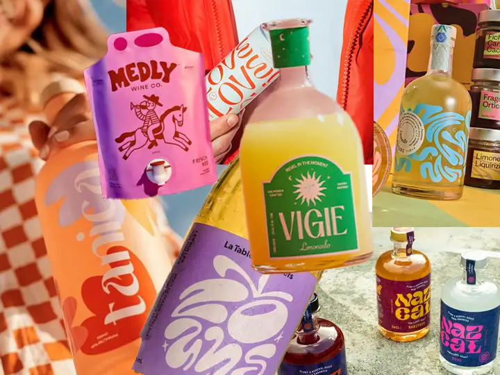
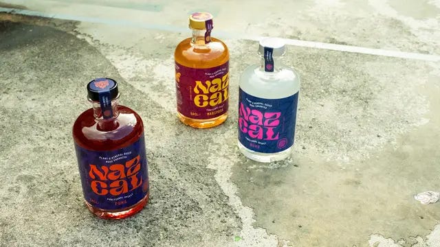
But, over the past few years, spirits branding has started to shift. Gone are the days when bold, minimalistic, and hyper-masculine aesthetics overwhelmed the shelves. Instead, a new wave of typography has emerged; it’s dreamy, curvaceous, and full of organic movement. It’s a visual style that feels nostalgic and fresh, romantic yet modern.
But why now? And what does it say about the shifting relationship between alcohol and the next generation of drinkers?
With Gen Z reportedly drinking less than previous generations, brands are looking for new ways to capture their attention—not only through the liquid itself but also through the entire lifestyle the brand represents.
Jesse Reed, Founder of Order Type Foundry, sees this new typographic direction as a reaction against the stark, bold aesthetics that have defined spirits packaging for decades. “If you look at the more ‘traditional’ spirits packaging, you’ll see a combination of bold and stark approaches, think Absolut vodka, as well as ‘crafted maximalism,’ think Hendrick’s gin,” he explains. “One conclusion could be that this ‘dreamy-wavy-goopy’ approach is an intentional backlash to what we’ve seen in the past 20 to
30 years.”
Chloe Gordon, Designer (and definitely not yours truly) and Founder of Anotherside, echoes this sentiment. “The amount of whimsical and fluid typography we’re seeing in this space feels almost reminiscent of holistic health and wellness,” she says. “Perhaps this is an underlying link emerging between wellness and low and no alcohol, bleeding into the higher ABV spirits category.”
Adam Vicarel, Creative Director at Vicarel Studios, also connects this typographic trend to the broader wellness aesthetic. “It’s leveraging some of the equity and mass appeal that the wellness industry has built up,” he notes. Spirits may be latching onto that a bit, especially if they’re non-alc, which is not only connected to wellness but also feels ‘LA’ and aspirational.”
The fonts seen in today’s spirits branding feel inspired by the psychedelic, wavy letterforms of the ’60s and ’70s, as well as the stretched, distorted type trends of the ’90s and early 2000s. It’s impossible to ignore the growing influence of the cannabis industry on this aesthetic shift.
According to NPR, daily marijuana use in the US now outpaces daily drinking. And as more consumers trade cocktails for cannabis, the branding of both worlds has potentially started to blur.
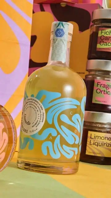
The relaxed, playful typography, soft organic shapes, and whimsical color palettes seen in today’s spirits branding feel identical to that of THC-infused gummies or a CBD tincture. It’s branding that speaks to a mindset rather than a product, one that prioritizes a sense of escapism over the traditional markers of alcohol’s past.
Jesse compares the movement to his teenage years: “If you walked through the mall and went into stores like Spencer Gifts, Claire’s, Hot Topic, or PacSun, what you would experience is very familiar to the trends we’re seeing today. Ovals with thick strokes, stretched type, absolutely zero Helvetica, and a total disregard for structure or order that was the point!”
Adam Vicarel agrees that the style draws heavily from 90s design. “Like Gen Z fashion inspiration, this design language seems to be rooted in 90s design trends—playful, energetic, slightly abstract, bright colors, and retro-futuristic motifs,” he says.
This reference to nostalgia plays into a larger trend of brands leaning toward aesthetic storytelling. The bottles become keepsakes, intended to live on bar carts and kitchen shelves long after they’ve been emptied. “Purchasing a bottle of alcohol is no longer purely just for consumption,” says Gordon. “It’s to act as a piece of decor in the home.”
Historically, spirits branding has embodied a particular vision of masculinity, steeped in prestige, power, and indulgent excess. Think dimly lit lounges with cigar smoke heavy in the air, mahogany bars, and the quiet clink of ice in a cut-crystal tumbler. Whether through serif-heavy logos, dark color palettes, or minimalist sans-serifs, alcohol brands have long projected an air of authority and seriousness, evoking the world of private clubs, top-shelf exclusivity, and a certain old-school bravado. But this new wave of branding is flipping the script, shedding the weight of tradition in favor of something fresher, more playful, and less tethered to the past and the conventional ideals of masculinity.
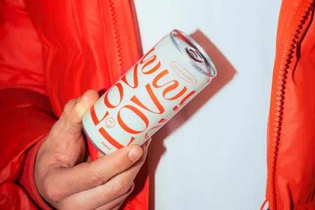
“The spirits category is historically and overwhelmingly masculine,” Vicarel explains. “A more contemporary or even feminine design aesthetic certainly has the opportunity to stand out on the shelf.”
Gordon agrees, “The departure from masculinity in spirits is definitely happening,” she says. “We can see this even through RTD brands like Pals and Curatif, which invite plenty of playfulness, color, and the use of illustration onto their cans—this is a complete 180, and dare I say rejection, of the refined, old-world, and heritage-heavy bottles we’re used to seeing.”
Spirits brands recognize that a new generation of consumers, many of whom are women, want something different from the traditional whiskey-and-cigar vibe of the past.
“I believe this brand strategy has staying power. There’s a genuine, powerful backlash against corporate culture. Consumers want products that align with their values, and many companies now offer “alternative” products featuring anti-consumer elements like sustainable practices and responsible operations, shares Jackson Showalter-Cavanaug, Type Designer at Okay Type. “The style has become an effective signifier for these values. However, the style itself is likely temporary. It will evolve gradually, as it already has, from blob-like Cooper Sans-inspired designs to current floral Art Nouveau styles, that’s simply how typographic trends progress.”
So, despite its current popularity, some designers believe this wave of typography will quickly fade. Jesse sees it as part of the natural cycle of design trends. “It’s already on the way out, and now we’re seeing a move towards ‘ugly-good’ design,” he notes. “That said, there’s still a strong presence of more ‘classic’ or ‘minimal’ design approaches, specifically in beverage packaging, that seems to always remain stable.”
Capucine Labarthe, Design Lead at Wedge, notes, “While unique fonts can lend a brand a unique personality that conventional typefaces often lack, they also risk becoming fleeting trends. Though visually captivating, highly decorative typefaces can quickly feel overused and lose their impact as more brands embrace the same aesthetic. The challenge lies in striking a thoughtful balance—embracing typographic innovation authentically and enduringly rather than merely chasing a passing trend.”
Gordon also warns of “shelf fatigue,” where an oversaturation of similar designs can lead to brands blending together. “As more and more brands tap into this, there’s the risk of becoming white noise,” she says. “It’s when these trends are done right, when the type extends beyond just front-of-pack and plays out across collateral just as well, that we can see this become less of a trend and more long-lasting.”
Still, one thing is clear: as alcohol consumption declines among younger generations, branding will need to do more than ever to justify its place in the consumer’s lifestyle. “Consumers will need more than just a ‘pretty bottle’ as a reason to add to cart,” Gordon points out.
The rise of dreamy, fluid typography in spirits branding signals a shift toward a more expressive, lifestyle-driven approach—one that appeals to Gen Z’s love for nostalgia, aesthetic storytelling, and emotional connection. “I believe designers today are experimenting more with fonts and moving away from the safe, minimalist typography that defined the 2010s, seeking more expressive and unconventional fonts to make a statement,” shares Labarthe. “Fluid, curvaceous, and whimsical typefaces offer a sense of personality and playfulness that conventional fonts often lack. This shift aligns with the evolving Gen Z aesthetic, which embraces individuality, nostalgia, and a more emotionally driven approach to design. As brands compete for attention in an increasingly saturated market, these bold, experimental fonts help create a distinctive and memorable visual identity.”
While this specific typographic trend may not last forever, its impact will. It has opened the door for a new way of thinking about spirits branding that prioritizes playfulness, inclusivity, and a break from tradition.
It remains to be seen whether this is a short-lived trend or a lasting shift. But for now, the spirits aisle has never looked more whimsical.
Stay Fresh!