
If one more person tells me Gen Z is obsessed with nostalgia, I’m hurling my laptop out the window.
Not because they’re wrong, but because it’s become the only marketing trick most brands seem interested in deploying. In reality, it feels a lot like a creative Band-Aid. Risk tolerance has taken over, and nostalgia is what brands reach for when they can’t afford to fail, but it’s nothing strategic or clever.
But I do get it.
The last few years have handed people an unrelenting stream of things to be anxious about. Inflation is making what used to be an average grocery run a checking-account thief of joy; the housing market has affected future generations’ ability to purchase homes; and a constant, always-on news cycle makes people’s jaws tense, and their shoulders stay up high. When the present feels unstable, and the future feels scary, the past sure does become safe.
Not to mention, the data backs brands up. A peer-reviewed, six-experiment study found that inducing nostalgia made consumers willing to pay more for products because those warm, sentimental feelings satisfy a need for social connection. Nostalgia sells, and it makes sense that people would want to buy their way back into a moment that felt simpler, even if it’s half-remembered. So no, I don’t blame consumers for wanting comfort. What I blame brands for is recognizing that hunger and deciding that the easiest way to feed it is to keep serving the same ideas on repeat, instead of asking what comfort could look like, if that’s the problem trying to be solved.
“To us, the popularity of nostalgia came from the reaction to everything looking way too clean, 2D, boring, the same. Minimalism got boring. Techy, cold design all looks the same eventually. Also, the fact that people want to escape the world we live in these days factors into it, too. Nostalgia is an incredibly efficient visual shorthand. You can borrow a typeface, a color palette, a tone for language, a packaging convention from another era and immediately create familiarity and feeling,” Ashley Jones, Creative Director at Creech, shares with me.
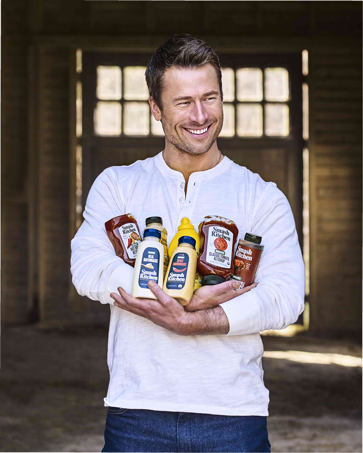
“There are categories where familiarity is just really useful. We recently branded Smash Kitchen, and when you’re designing ketchup and mustard, you’re competing with products and brands people have known their entire lives. There are certain things that feel familiar or appropriate to the category because they’ve been proven to work. We don’t think the goal should always be to throw those things out just for the sake of being new. The opportunity is to understand what deserves to stay, and then figure out where you can push,” continues Jones. “For us that’s the distinction. Looking backward can be incredibly generative when you’re extracting an idea, an attitude, or a truth, or even recognizing a convention that has earned its place. It gets less interesting when you’re just extracting an aesthetic”
Something that converts or wins with consumers this consistently stops being a creative decision and quickly becomes impulsive and without thought. It becomes the packaging equivalent of a social media trend. How many times have you seen the butter yellow text over an Instagram reel lately? How many people can share what they think is chic? Algorithmically, it works, sure, and the “creative” might convert. Still, when an entire industry of talented people stops pushing the limits because it’s an easy way to hit numeric goals, we find ourselves in an interesting conundrum.
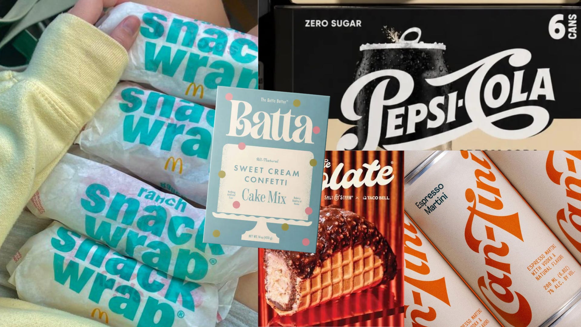
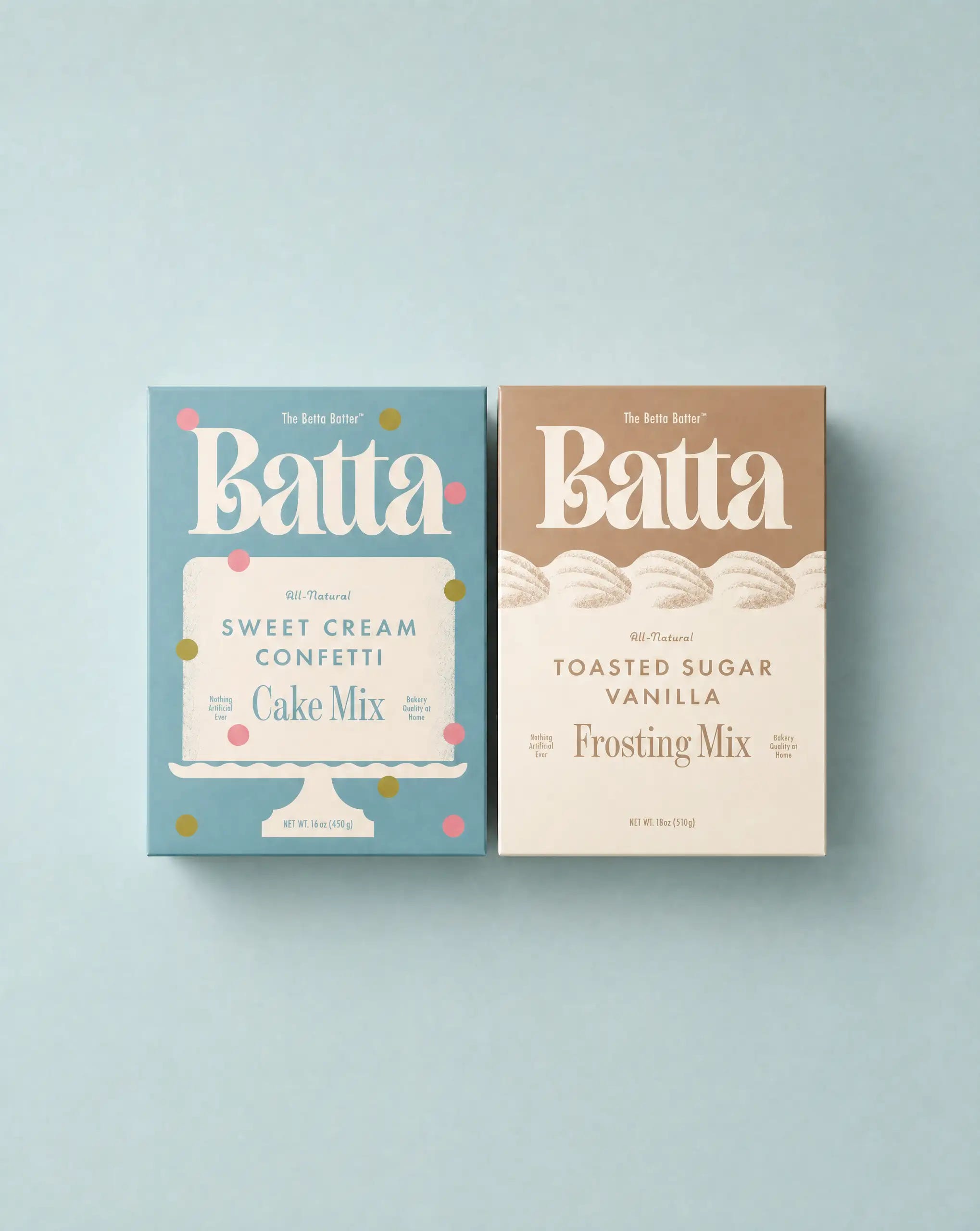
It is also intriguing that brands have started calling out the nostalgia of it all in press releases. KFC’s U.S. CMO announced the return of popcorn chicken this summer and put it on the record that the comeback was about “nodding to nostalgia” while modernizing the brand, as if those two things obviously go hand in hand. Last summer, the return of Diet Cherry Coke was a nostalgic fever dream come true. Even smaller brands like Batta are betting on the nostalgic take. Christina Fischer at Studio MPLS recently shared with me that she hoped “to balance both a modern aesthetic and a sense of nostalgia” for consumers. But increasingly, “nostalgia” is just a word being slapped onto a press release with no meaning behind it at all.
They’re all the same idea, repeated and repeated once again for good measure.
“Brands follow culture, and culture is on a nostalgia loop: we’re mining the (increasingly recent) past and repackaging it for the present. In 2014, the late theorist Mark Fisher used the term ‘the slow cancellation of the future‘ to describe a sense that no genuinely new styles or movements are emerging, only recycled ones,” Senior Strategist, Claren Walker. at Porto Rocha, notes. “We see it everywhere in brand: from newcomers like Vacation borrowing ‘80s decadence to sell sunscreen, to Burger King recreating ads straight out of the ‘90s, to heritage fashion houses reissuing more bags than they design.”
She goes on, “Some of this is a reaction to a decade of blanding and the sans-serif identities that made everything look the same. But it’s also become a convenient shortcut and turned into its own kind of boring. Nostalgia lends a brand emotion, familiarity, and recognition it would otherwise have to earn, which helps if you don’t have a history of your own to draw on. It’s nearly impossible to design something with no reference to the past, but the brands that do it well start from something they own and then build on it to get somewhere new.”
But it’s not about creatives just being lazy. Last year, when Cracker Barrel dropped its identity to aim at a younger customer—a standard modernization routine straight out of the usual playbook—the backlash cost it nearly $100 million in market value in a week, and the company reversed course before the news cycle even finished processing it, publicly recommitting to the folksy original.
Pirate’s Booty took a similar beating online. In June, the Hershey-owned brand rolled out its most significant rebrand since 1987, working with agency Pearlfisher on a new wordmark, color palette, and a redesigned mascot with a modern, clipart-style overhaul that stripped away the parrot-shouldered pirate’s original personality. The backlash was immediate, with design fans calling it the latest casualty of a broader “blandification” trend. Some critics even speculated that the new logo had been generated by AI (it’s not). If anything, it’s matching current illustration styles that children, the brand’s target demographic, gravitate towards… like Paw Patrol.
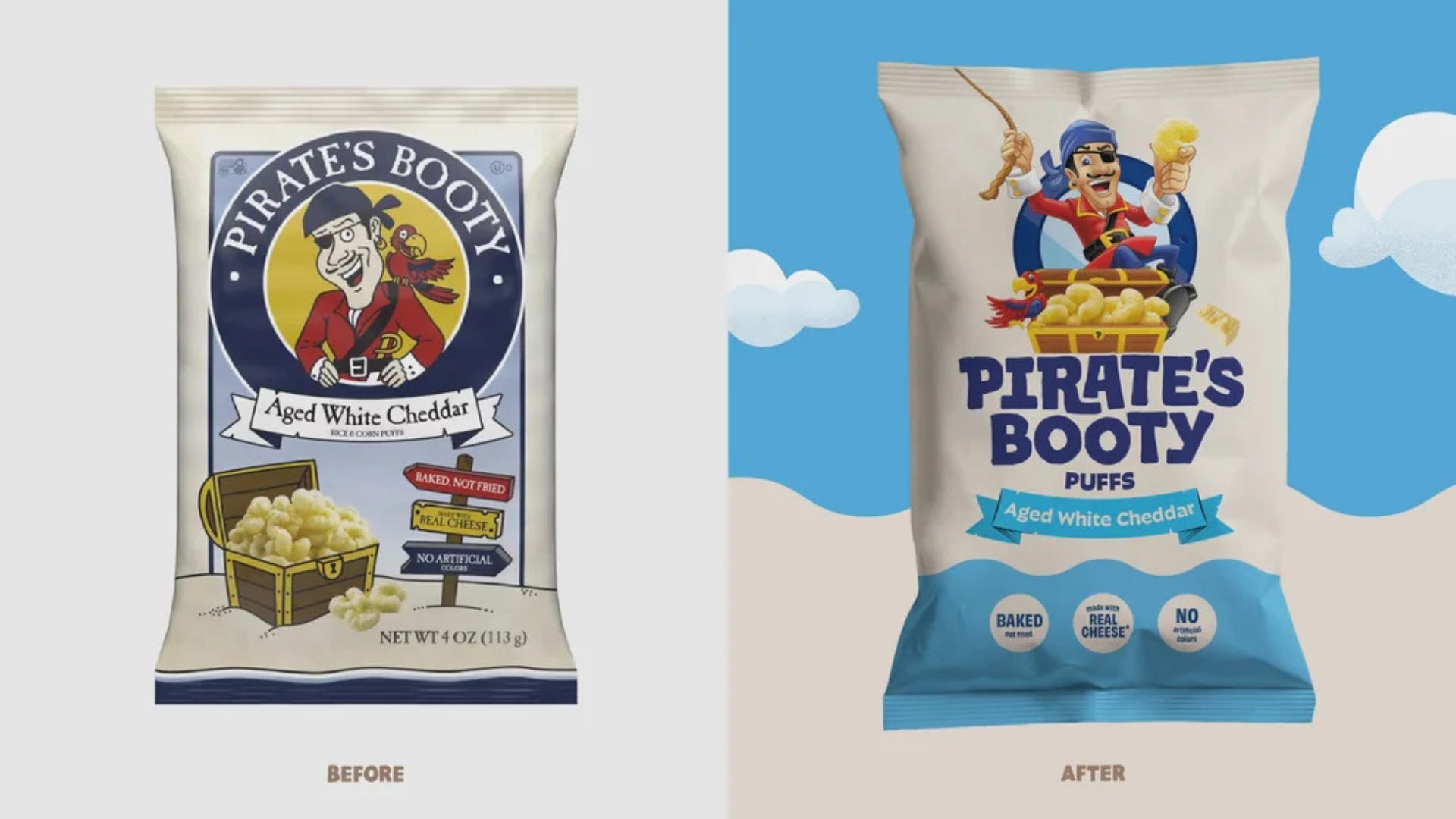
The launch suggested that Pirate’s Booty redesigned its mascot for a Gen Alpha customer it didn’t yet have, and, in doing so, alienated the adult fans it already had. Consumers were almost as upset as they’d been with Cracker Barrel, but if you’re an adult who’s going to stop eating Pirate Booty because you don’t like the look of the new pirate, I’d suggest maybe taking a step back and taking a breath.
I’ll admit these two examples complicate my own argument more than they support it. If stepping away from nostalgia keeps failing this publicly and this fast, the market is actively punishing the alternative. When a brand’s entire equity is stability, ditching nostalgia isn’t a smart move. But these two examples shouldn’t be enough to convince an entire industry that forward motion is impossible.
Kapono Chung, partner at Combo, states, “Forward-thinking design must be grounded in consumer and cultural insight; it can’t exist in a vacuum. Humans and taste are constantly evolving, and design needs to evolve right alongside them. Nostalgic design feels so easy and safe because it lets us stay comfortable in what we already know. Real forward-thinking design means resisting that comfort and paying attention to where culture is actually headed, not ignoring it.”
The interesting brands over the next few years will be the ones willing to figure out what “forward thinking” actually looks like, and it will absolutely have nothing to do with a brand’s archive.
“We feel the work that ends up feeling most forward-thinking often comes from paying closer attention to the company than to the category,” notes Griffin Creech, Founder and Creative Director at Creech. “Culture is obviously in the room. We all absorb it constantly. But we don’t think our job is to predict the next aesthetic. It’s to make something specific enough that it doesn’t need to follow one.”
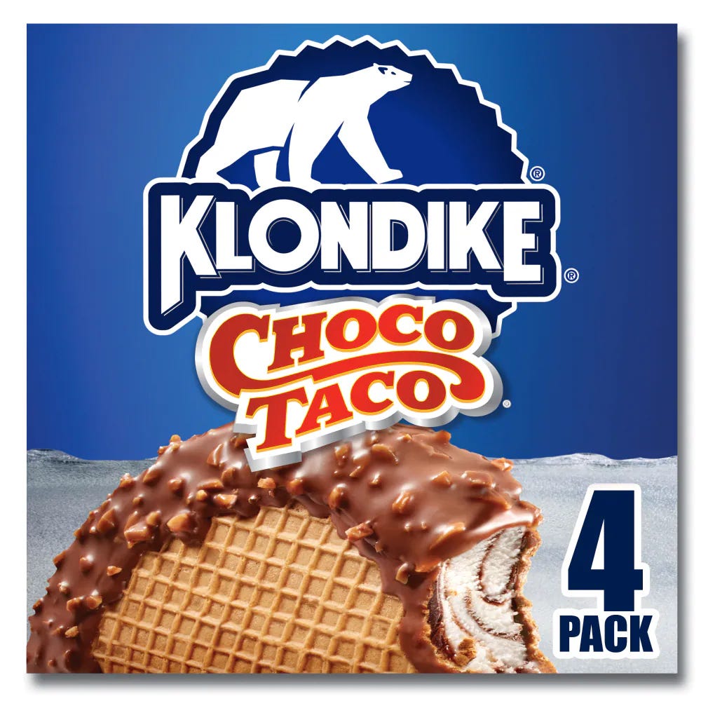
The choco taco might be nostalgic now, but at one point, it was the pinnacle of innovation.
Until next week,